Nov
2014
Another RCL Post
I was watching T.V. earlier this week when I saw a commercial for either Coca-Cola or Pepsi that said that they were partnering with other companies in order to create a healthier, balanced life for people. I was honestly appalled at this because they are obviously just trying to make soda seem better for you than it actually is. This really upset me because the commercial was targeted at families and children. I thought that it would make a perfect topic for my post, but after scouring the internet, I can’t seem to find it. I did, however, come across something worth talking about on Coca-Cola’s website.
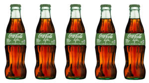
I personally haven’t seen these in stores yet, but Coca-Cola has released a new spin on their classic soft drink. Coca-Cola Life is a low calories alternative that is made with cane sugar and stevia leaf extract.
This company already has other low-calorie options like Coke Zero and Diet Coke, so why would they take this spin on things? They want to make their consumers see them as healthy. They do this by using several different things.
They use ethos because…well let’s face it. Who doesn’t know what Coca-Cola is? They are prevalent in our everyday lives from sporting events to our own refrigerators. This is a well established company that we all know and love from the precious polar bear commercials that always seem to show up around Christmas. As consumers, we trust the company as soon as we see the logo on the bottle or the box.
This is a good example of pathos because, as Americans, we are subjected to the bandwagon effect. All of the country people are focusing more and more effort on becoming skinnier and more attractive, so everyone wants to be healthier. In order to stay up to date with the latest trends and fit in with peers, we conform to that style of healthier living. If the company says that their product is now healthier, then we going to believe them and buy it.
Coca-Cola also appeals to logos here because of what they do with the style of the label. Logically, we attribute the color green with healthy. We associated the cursive handwriting with something that’s down-to-earth. Both of these things also appear on packaging of organic and socially deemed healthy foods.
