This post will describe a cool new data visualization tool offered in Excel 2016. This tool is called 3D maps and it builds on the Power Maps Tool excel offered in the 2013 version. The uses of this tool are limitless, but essentially it allows a user to display any kind of numeric data, geographically. The map tool also has an animation feature which allows the user to incorporate a time axis as well.
To demonstrate an application for this tool, I retrieved the crime data from Chicago. An important note is for the map feature to work, it needs a way to find the location of each data point. In this case, the crime data had latitude and longitude. This makes it very easy for the map to locate, but the map feature can also use country name, city name, zip code, counties, and addresses to find the location.
When I imported the data it looked like this.
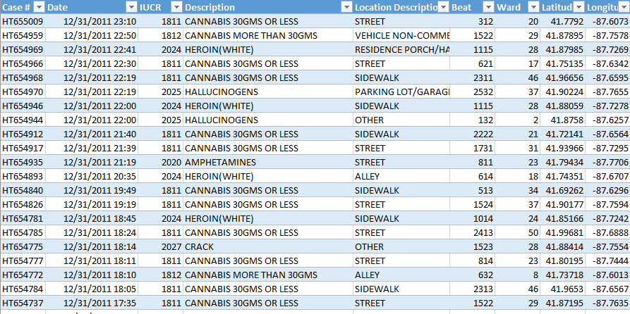
Except 38,450 lines of that, detailing all of the crime in Chicago during the year of 2011. From this table, it is easy to sort by description of the crime to see how many of each type of crime occurs, but is essentially impossible to look at 38,000 different longitudes and latitudes and figure out where the crime is occurring.
Once you have the data in excel, you can easily insert a 3d map. From here you have many options. How do you want to display the data? What theme do you want? Do you want to move the data along a time axis?


On the right is a heat map of the arrest and the left shows the data colored by category of the arrest. You may notice there is a lot of light blue. That is “Cannabis 30GMS or Less.” To see this data without any cannabis related arrests, I can filter the data by description to see all of the arrests not related to cannabis.
This video shows crimes not related to cannabis, animated by when they occurred throughout the year. In this video Red is Cocaine and Green is Heroin and the tan color is Crack. This video starts to give you a better of idea of where and what crimes are occurring.

Above is the percentage of students who scored proficient in the SAT’s in 2013 in Connecticut by School District. In this example, I tested the ability of Excel to find the location of each school district from the district name. Originally, it put about 60 percent in Connecticut, some in other states, and a lot in the United Kingdom (obviously this makes sense as a lot of settlers named the towns in Connecticut after the UK, but I thought it was an interesting takeaway). However, once I added another column saying the schools were in Connecticut, Excel noted that it was confident with 80% of the locations, and all of the bars were located in Connecticut. On a more in depth level, one could layer on crime data or economic information to draw correlations.