Monthly Archives: October 2017

3D Maps Continued

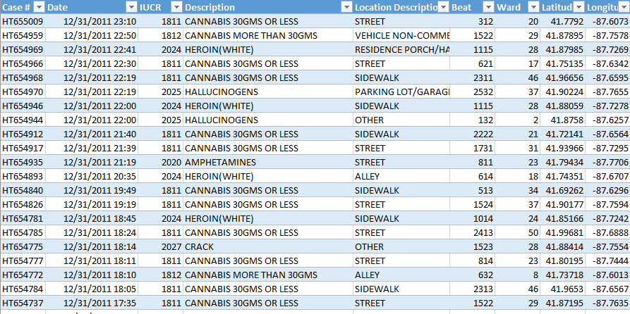
Seeing hoards of students file out of Thomas during class change, a question occurred to me. Where are the most crowded areas on campus during class changes? It is a simple question, but I realized it would be difficult to measure and provide any type of quantitative support. One method could be standing at various places on campus and counting as people walk by, but winter is coming and also I didn’t want to stand outside and count people walk by. My next thought was to figure out where the majority of students’ classes are and assume that the most crowded  areas surround these classes. This seems like a simple endeavor, but once again, I found it difficult to quantify “where most peoples’ classes are.” To estimate this number, I ended up on a PSU registrar website which was intended to be used for finding open classrooms for meetings or events about ten years ago. However, from this site I was able to browse the location of every classroom on Penn State’s campus. I narrowed this down to classroom’s over the size of 50 because I decided that this would be the easiest way to determine where students were. From here, I pulled all of the buildings on Penn State that had multiple classrooms of over 50 people or any classrooms of over 100 people. The raw data is shown below.

Before I continue, I would like to acknowledge that there are many flaws with this method of determining where streets are the most crowded. First, these are just empty classrooms. There is no guarantee that there are a lot of classes held in any of these classrooms. Next, I completely ignored any classroom that holds less than 50 people. Third, this classroom size data is from over a decade ago. Fourth, the amount of paths to each building affects how crowded each path is.

However, this was the best method I had. And looking at this spreadsheet, I would be willing to bet that you have a class in one of the top three buildings by classroom size (Willard, Forum, or Thomas). Anybody in RCL-002 who wants to take me up on that bet, you know where to find me.

Moving on, how does this data show where it gets crowded? This is where I will incorporate the 3d maps tools I discussed in my last blog post. I used Longitudes and Latitudes from Google Maps to locate each building and created the maps found below.

Looking at the maps, really the only clear conclusion I can draw is, it is and will always be busy everywhere during class changes.

The height of each bar represents the total volume of classrooms in the building.


This is just a typical heat map where the red indicates more traffic.


If anybody is interested in interacting with the maps, you can go to hit the link below, scroll over to insert on the excel ribbon, hit 3D maps, and then select tour 4.

ClassSizeData-1gdr7iu

3d Maps

This post will describe a cool new data visualization tool offered in Excel 2016. This tool is called 3D maps and it builds on the Power Maps Tool excel offered in the 2013 version. The uses of this tool are limitless, but essentially it allows a user to display any kind of numeric data, geographically. The map tool also has an animation feature which allows the user to incorporate a time axis as well.

To demonstrate an application for this tool, I retrieved the crime data from Chicago. An important note is for the map feature to work, it needs a way to find the location of each data point. In this case, the crime data had latitude and longitude. This makes it very easy for the map to locate, but the map feature can also use country name, city name, zip code, counties, and addresses to find the location.

When I imported the data it looked like this.

Except 38,450 lines of that, detailing all of the crime in Chicago during the year of 2011. From this table, it is easy to sort by description of the crime to see how many of each type of crime occurs, but is essentially impossible to look at 38,000 different longitudes and latitudes and figure out where the crime is occurring.

Once you have the data in excel, you can easily insert a 3d map. From here you have many options. How do you want to display the data? What theme do you want? Do you want to move the data along a time axis?

On the right is a heat map of the arrest and the left shows the data colored by category of the arrest. You may notice there is a lot of light blue. That is “Cannabis 30GMS or Less.” To see this data without any cannabis related arrests, I can filter the data by description to see all of the arrests not related to cannabis.

This video shows crimes not related to cannabis, animated by when they occurred throughout the year. In this video Red is Cocaine and Green is Heroin and the tan color is Crack. This video starts to give you a better of idea of where and what crimes are occurring.

Above is the percentage of students who scored proficient in the SAT’s in 2013 in Connecticut by School District. In this example, I tested the ability of Excel to find the location of each school district from the district name. Originally, it put about 60 percent in Connecticut, some in other states, and a lot in the United Kingdom (obviously this makes sense as a lot of settlers named the towns in Connecticut after the UK, but I thought it was an interesting takeaway). However, once I added another column saying the schools were in Connecticut, Excel noted that it was confident with 80% of the locations, and all of the bars were located in Connecticut. On a more in depth level, one could layer on crime data or economic information to draw correlations.

One More Week

In honor of Christmas in October, i.e. basketball season starting next week, this post will be dedicated to the greatest basketball team of all time and the stats accompanying them. That being said, most people are unaware that this team is the greatest of all time, as they have finished third to last, last, and fourth to last in the NBA in the past three years. But the year where Philadelphia 76ers fans can finally start rooting for wins instead of losses has come! Due to the ability of top NBA talent to impact teams, the value of getting a top draft pick is far more important than winning a few more games and being a mediocre team instead of a bad team, thus losing games often helps in the long run.  At least this was the 76ers and their General Manager’s (until he was pushed out) strategy. Side note, I hate the ownership (Josh Harris) for pushing out Sam Hinkie (a strong proponent of analytics) for a new GM Bryan Colangelo (a “basketball” guy). Sam Hinkie built the foundation of this team and should be remembered for  this when the 76ers ascend to basketball greatness.

It may seem like I am pretty confident the 76ers are going to be great and that would be because I am. So this might seem like a foolish attitude based on the fact that they have been consistently terrible the past few years: it might be. But my hopes and the hopes of 76ers fans lie heavily upon a single player: Joel Embiid. Joel was drafted third in the 2014 NBA draft, despite only playing part of a college season because of injury, and not starting to play basketball until he was 15. The reason the 76ers were able to select him at the third position was because Embiid had just underwent surgery on his foot, scaring off the top two teams. Teams often steer clear of centers with Knee problems as these problems often reoccur and can end players’ careers.

Fast forward three years and many of the worst fears about Embiid have comw to fruition. He has played a total of 31 games (out of a possible 246). Embiid has had two surgeries on his foot as well as surgery to repair a torn meniscus in his knee. But despite this, the 76ers just signed Embiid to a five year 148 million dollar contract. How can you get 148 million dollars by playing 31 games? Why does a a team and a city put all of their eggs in an admittedly injury prone basket who has played about 10 percent of his games? The short answer to the second question is the two other potential stars on the 76ers have both played 0 games (One missed a season with a broken ankle and one was just drafted).

The slightly longer answer is there are a few reasons.

  1. Out of players who averaged 20 minutes per game, Embiid was fourth in points scored per 36 minutes played. This is a common traditional statistic that simply tracks how much a player scores.
  2. Embiid was 15th in the league in rebound percentage. This is an advanced stat tracking the percentage of rebounds a player gets when they are on the floor. This isn’t particularly impressive on its own but consider good rebounders are often poor defenders.
  3. Out of players who averaged over 20 minutes, Embiid is first in the league in his defensive rating. This is an advanced statistic that measures the impact a player has defensively. Other statistics depict how the 76ers were the best defense in the NBA when Embiid was on the floor and one of the worst when he was sitting.
  4. Finally, in terms of PER rankings, an all encompassing efficiency metric that ranks all players in the NBA, in his rookie season Joel Embiid came in 16th. Essentially, Embiid has played part of a college season and part of a NBA season and is already one of the best players in the world when healthy.

To conclude, in all aspects of his game Embiid has proven he is an elite talent capable of carrying the 76ers to greatness. He just needs to stay healthy.

P.S. I just watched the 76ers preseason game (which I told myself meant nothing when the 76ers got blown out) and Embiid had 22 points and 7 rebounds in a mere 15 minutes (so in this case preseason definitely means a lot and perfectly predicts the season). There is no way to describe this other than these numbers feel like they are straight out of a video game and Embiid feels like he from another planet.

Statistics were from NBA.com

Shopping

Last week, I covered the best dining halls to eat at. This week, I will cover the important stuff. Where to get your snacks.

In this post, I will cover a few different common shopping locations for Penn State students. These will include the Penn State food service stores, Mclanahans, Target and Amazon. At these stores I compared the prices of some college essentials: a box of Cheerios, a tube of Crest toothpaste, Nyquil, Oreos, Nature Valley granola bars, Clif bars, and Chobani yogurt.

On the left: The raw costs of each time at each place. Parentheses represent buying packs or boxes of the item.

On the right: The cost of buying one of each product at each store.

While the chart on the right does a good showing the price of buying one of each product, this unevenly weighs some of the products that have very low prices, such as one nature valley granola bar or one Nyquil capsule. While expensive products like Oreos or Cheerios are weighed much more heavily.


These charts normalize the average prices of each product. Essentially, all the prices are scaled so the average price of each product is 100. So, any product less than 100 is below the average price between all of the stores and any price above 100 is above the average price. As you can see, the lowest “price” (the lowest number in each row) varies by product. No single store has the lowest price for everything. But, when you add up all the normalized prices, Target emerges as the cheapest place to shop.

This chart shows the average normalized price for each store. 100 is average, below is cheaper and above is more expensive. As you can see, on average, Target is the cheapest, followed closely by Amazon, and Mclanahans, with the Penn State food stores lagging.

However, price is only one aspect of shopping. The shopping experience at each location has different strengths and weaknesses, summarized below.

PSU Store Strengths: Extremely convenient location. Fastest  way to get something. Can spend your parents money (Meal points)

PSU Store Weaknesses: Most expensive. Cramped Stores.

Mclanahans Strengths: Pretty good variety. Closer than Target. Reasonable prices.

Mclanahans Weaknesses: None of their strengths are that strong.

Target Strengths: Cheapest. Very pleasant shopping experience. Large selection.

Target Weaknesses: Furthest away from dorms.

Amazon Strengths: Can order from anywhere. Large Selection.

Amazon Weaknesses: Takes a few says to ship. Can’t order fresh/refrigerated/frozen foods.

In summary, the PSU stores are the fastest way to get snacks. Amazon is the best option if you don’t want to leave your dorm. Mclanahans is suitable if you want average prices without walking to Target or if you want Crest toothpaste. All around,Target is the best option if you want cheap prices a wide variety of options and a great shopping experience.