Meta

Because my blog consisted heavily of sharing information and statistics, I thought an apt conclusion would be an analysis of how Americans approach facts and information.  A new Pew Research study considers how a variety of different factors impact people’s attitudes towards information.

Pew Research broke up people into four different groups based on their willingness to learn new information: The Eager and Willing, The Confident, The Cautious and Curious, The Doubtful and the Wary. The Eager and Willing made up 22% of U.S. adults and consisted of people who actively sought out learning. Minorities made up 51% of this group. The Confident group made up 16% of U.S. adults. These people had a strong interest and trust in information sources and was composed heavily of white, educated adults who were relatively comfortable economically. The Cautious and Curious group (13%) has a strong interest in news and information, but were not particularity trusting of national news organizations, financial institutions and the government. This group generally represented the U.S. population. The next group was The Doubtful (24%), who were skeptical of information sources, particularly local and national news. This group was mainly made up of white, relatively well educated adults. The last group was The Wary (25%) that had the lowest trust in information sources and were primarily males aged 65 or older.

Where do you fit in?

An interesting result of this study is how information can be conveyed to people in each group. It becomes clear that different strategies should be used based on a group’s willingness to accept it. Another interesting takeaway was the roll of trusted institutions in building information literacy skills. Adults who have visited libraries are overrepresented in the two groups that were most receptive of information. These groups were also more likely to say they trusts librarians and use libraries as information sources. This demonstrated the importance of public libraries in advancing the public education of the populace.

Additionally, below are the subjects that are of most interest to people.
1. School or education
2. Government and politics
3. Health and medical news

Next are the most trusted sources of information
1. Local public library or librarians
2. Health care providers
3. Family or friends

While Local news organizations topped National news organizations in perceived trustworthiness, both were lower on the list. Finally, 31% of people said they were getting a lot of training on how to find online resources and 24% of people said they were getting none.

The general purpose of this post was to make you consider different peoples attitudes and preferences for taking in information.

Trust The Process

In the beginning of the year, I wrote a post proclaiming that the 76ers were the best team in the world, despite finishing 4th to last, in the past year. The NBA season ended yesterday with the 76ers beating the Bucks 130 to 95 for their 52nd win of the season. This took them the fifth best record in the entire NBA. From 4th to last to 5th in just one year!?!? This post is dedicated to all the people that I told the 76ers would be good “someday” as they were continually finishing as one of the worst teams in the NBA. Somehow the 76ers won 52 games this year, beating the Las Vegas over under of 42, that many people thought was too high. Further, they closed out the season winning 13 straight games. How did they do it? I am not sure, but I can take a few guesses.

Ben Simmons

I expected Simmons to be good, maybe great, but not this sensational this fast. Ben finished the year as just one of three NBA players with over 600 points, 600 rebounds and 600 assists. He was third in the NBA with 3 triple doubles (more than 10 points rebound and assists in a game). He was also the first player in NBA history to average a triple double over a 13 game win streak, propelling the team forward after Embiid got injured.

Joel Embiid

Embiid fractured his orbital bone as the season came to a close, but he has undoubtedly been one of the greatest nba players of the season. Based on the Player Impact Estimate advanced statistics, Embiid is the 6th most impactful player in the NBA. Additionally, he has the 5th highest defensive rating. Further, he averaged 22.9 points per game, 11 rebounds per game and 1.8 blocks per game.

Finally, it would be wrong to neglect mentioning the man who put it all together: Sam Hinkie. Hinkie served as the gm of the 76ers from 2013 to 2016. In this time, he made many long term oriented trades, accumulating draft picks and long term assets in exchange for short term assets. This made the team very bad for a few years, but eventually there sunrise in Philadelphia and Hinkie’s long term moves started to pay off. Unfortunately, Hinkie was pushed out by management and no longer works for the NBA, but 76ers fans know that he is responsible for their current success.

The NBA playoffs start April 14 with the 76ers playing the Miami Heat. Currently, Embiid is ruled as unlikely to play in Game 1, but as we have seen miracles happen.

Meal Plan Calculator

SPOILER: If you don’t want to read this post, there is an excel document that will calculate how many meal points you have used versus how many you should have used. Click the link below to use it.

Meal Plan Calc-2nwj8zh

Have you ever wondered whether you have enough meal points to buy an overpriced box of cereal at a campus store (Side Note: If you want to see how overpriced the box of cereal is, check out my second blog post (It’s about two times as much as downtown)), while having enough meal points to eat at the end of the year? Well, its an issue that I regularly face. On Penn State’s ELiving site there is a calculator, but I found it most unhelpful, so I made my own.

A few things to mention before I describe it. Most importantly, if you realize that you will have a lot of meal points left over, you can still downgrade your plan until the last day of classes. This is important because any meal points in your account of the end of the school year will lose all value. The calculator assumed that you started spending meal points on the first day of this semester and will run out on the last day of finals. Finally, today’s date will automatically update so don’t worry about that.

Anyway, it should be pretty self explanatory, but I will list the steps to use it. First, you need to be on a computer that has Excel, but most computers have it. Second, click the link above to download the document. Click enable editing to edit the document. Select what meal plan level you chose in the beginning of the year (this helps calculate what pace you should be on). Next, if you know how many meal points rolled over from the fall, you can put this in. If you don’t know, it’s not a big deal and you can leave this blank. Then fill in how many meal plan dollars you have left. You can find this number on the register after you checkout or it’s on the ELiving website. Once you put those two numbers in, you will get a few numbers. You will get the “Correct Pace” which represents how many meal points you would have left if you spent exactly the right amount each day. You will get the amount over or under this pace and finally you will get how many meal points per day you should spend to reach $0.00 by the last day of finals. Hope this helps.

P.S. If you find out that you have extra money on your account, you can buy me food. Unfortunately, I am going through meal points too fast this semester.

Bracket Time

It’s that time of the year where statistics about how the U.S. workforce is less productive during the first two days of the NCAA tournament than Christmas morning are spread rapidly. Of course, many other statistics come out, some of which actually relate to the basketball teams playing the games.

Full disclaimer: I have made enough brackets in my life to know one statistic for sure. No matter how I pick my bracket, there is a 100 percent chance that I lose to my mom who I am convinced picks teams based on their mascots.

Moving on to the statistics I used to make my bracket. I used FiveThirtyEight’s bracket forecasts ESPN’s average predictions to make my bracket. Links to both are below.

https://projects.fivethirtyeight.com/2018-march-madness-predictions/?ex_cid=rrpromo

http://games.espn.com/tournament-challenge-bracket/2018/en/whopickedwhom

Generally, when I make my bracket, my main strategy is to find teams that have the highest chance of winning (based on FiveThirtyEight predictions), that the least amount of people are picking (based on ESPN’s lists of who people are picking). Meaning, I try to pick the good teams that nobody else is picking. To explain why I believe this is a good idea, consider this example:

To win any kind of bracket group that is more than 4-5 people, you generally have to get the national champion right (barring extremely strange cases where a huge underdog ends up winning the whole tournament). Lets assume you have a perfect set of projections that has Villanova with a 55% chance of winning. You should obviously take them because they have the highest chance of winning, right? Well, in my opinion, it depends how many other people picked them. If we assume 90% of people in the group picked them, then even if the 55% comes to fruition, 90% of people are still in contention to win the group. As you can see, my strategy is meant to win the group or probably lose to everybody, based on its designed deviance from the average bracket.

Generally something that struck me when comparing FiveThirtyEight odds for each game compared to who people were predicting to win the game was how close to the actual forecast the general breakdown of people are. However, I will list some of the larger deviations from the FiveThirtyEight forecasts for National Champion.

Most Overrated teams: % chance of winning championship (% of people who predict them to win)

Virginia 13.740 (19.7)

Michigan State 6.84 (8.4)

UNC 5.313 (6.9)


Most Underrated teams:

Cincinnati 6.672(2.4)

Purdue 5.496 (3.2)

Villanova 17.962 (16.1)

Generally you can see that perennial powerhouses are slightly overrated while lesser know teams like Cincinnati and Purdue are generally underrated. Additionally, people may have shied away from Villanova due to their propensity to lose early in the past tournaments or not wanting to take the top seed. One final comment is that people generally chose to underestimate how likely top teams are to make it to the sweet sixteen and then overestimate how likely teams are to make it to the final four. This may have to do with people knocking out top teams early or keeping them in until the finals.

Best of Luck!

Irrational Basketball Shots

In this post, I will discuss a data set that shows essentially every basketball shot from the 2014-2015 season and some of the observations that have been derived from this data. Here is the location that the data set was posted: https://www.kaggle.com/dansbecker/nba-shot-logs

I will be commenting on some of the analysis others have already done on this data set.

First, DrGuillermo did analysis based on what happens to a players next shot after they miss or make a shot. This was based on analysis done on Kobe Bryant’s shots that indicated that after he missed a shot, he was more likely to take his next shot from closer and vice versa. With that being said, the likelihood of making the next shot was the same (controlling for difficulty of shot). What this means is there is no “hot hand” and each shot has the same likelihood of going in.

When this analysis was extended to the entire NBA population, the trend remained. NBA player’s shots if they made their last shot average about 1 meter longer than if they missed their last shot. However, after controlling for difficulty, there was no statistically significant difference between the odds of making the shot. Further, a player is about 3 percent more likely to take their next shot from the pain after they miss than after they make a shot. This shows a psychological inefficiency where players alter their behavior for no real reason.

Another interesting set of analysis done was to determine how strong of a defender each player was using opponents field goal against them. The analysis initially starts by ranking all players by percentage of shots made against them. Then they went into further detail to eliminate some of the outliers. For example, some players had extremely high or low levels because they only defended a few shots. These outliers were removed and only players who defended over 150 shots were included. Then opponents  points per shot was included to include the idea that 3 pointers are shot at a lower field goal percentage, but are worth more points. Then the analysis considered the distance each player was away from the shot compared to the likelihood of the shot going in. This helped distinguish longer defenders such as Anthony Davis or Draymond Green.

Finally, the analysis ended by noted that it found traditional top defenders including Serge Ibaka, Rudy Gobert, Pau Gasol and Tyson Chandler live up to their reputation, but also it noted that Steph Curry and Andre Roberson were often underrated in defensive ability. This was particularly interesting to me because since this analysis was published, Roberson has developed more of a reputation as an elite defender.

Link to data: https://www.kaggle.com/slangenborg/analyzing-the-best-defenders-in-the-nba

The Eagles are World Champions

This week, I have to deviate slightly from my typical posts to write about the most significant event of the year and probably the decade. The Philadelphia Eagles have defied all odds (and I mean every single set of betting odds) to win the Super Bowl.

Starting with last year, the Eagles finished a lackluster 7-9, placing them at the bottom of the NFC East. If you had said in the beginning of the year that the Eagles would win a Superbowl, I would have called you crazy. If you had said they would win a Superbowl, despite losing their MVP candidate quarterback and future Hall of Fame left Tackle Jason Peters, I would have laughed. How did the Eagles overcome the fact that they were a mediocre football team last year and lost two of their best players this year? I am still not completely sure, but I can offer an idea.

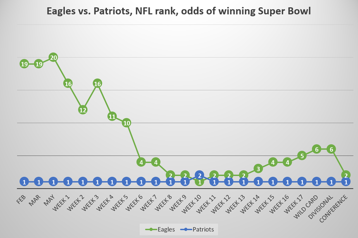
 Nick Foles. Nick Foles showed sparks of talent when he played for the Eagles in 2012 to 2014, but the Eagles did not see a long term fit with Foles and ended up trading him for another quarterback, Sam Bradford. Nick Foles started 11 games for Saint Louis in 2015 before starting just 1 game for Kansas in 2016. In 2017, Nick Foles signed a two year contract, returning to the Eagles to back up Carson Wentz. Foles started off slow, with a completion percentage of just 56.4% and a passer rating of 79.5, below the average of 88.6. But Nick Foles was just getting started. In the conference championship against the Minnesota Vikings, Foles completed 26 of 33 passes for 352 yards for three touchdowns and a 141.4 passer rating, the highest ever in a conference championship game. And this was against one of the best defenses in the league. Foles followed this performance up by going head to head against potentially the best quarterback of all time, passing for 373 yards and three touchdowns, even adding a receiving touchdown to lead the eagles to victory. Below, see a quarterback who considered quitting the league before the season, calling a trick play on fourth down in the Superbowl.

In total, Nick Foles had the highest postseason completion percentage of all time and the third highest postseason passer rating.

012918EaglesSuperBowlOdds

Above is a graph of the odds of winning the Superbowl by week. The Eagles started the season with 50-1 odds of winning, meaning that if you bet one dollar on the Eagles winning, you would have won fifty dollars. Even once they made it to the divisional round, they were given the sixth best odds to win out of the eight teams left. The Eagles were underdogs in all three playoff games.

Go Birds


Statistical Analysis of Candy Rankings

While it may not be Halloween time or even remotely close to Halloween time, I will be diving into the unending debate on the best Candy. Full disclaimer: I took the data set and some calculations from FiveThirtyEight, but created all the visuals and performed some of the more complex analysis. Second disclaimer: the following post will contain some hot takes and some straight up bad takes on candy. The following information is not representative of the views of Statistically Significant™ or Owen Wing.

First to create the data set, FiveThirtyEight created a program that generated random matchups of two candies and let a person choose which candy they liked more. Using this method, FiveThirtyEight sampled 8,371 different IP addresses who voted on about 269,000 randomly generated matchups. When I refer to the “win percentage,” I am referring to the amount of people who chose that candy, over the other candy it was matched with. Below is a table of the top 10 candies, out of the 85 tested, ranked by win percentage.

The worst performers include a lot of candies you would probably need to look up to recognize, but notable names include jawbusters, ring pops, candy corn, lemonheads and pixie sticks.

To take a deeper look into what makes a likable piece of candy, the candy’s components (chocolate, fruit, caramel, peanuts & nuts, nougat, crispy, hard candy bar, multi-piece) were evaluated on a binary scale (either it had it or it did not). From here, the average value added to the win percentage by having the component was calculated.  Below is the average value added by each component. The most valued trait of candy is chocolate, which adds an expected 19.9% win percentage vs. a candy that doesn’t have chocolate. Additionally, you can see, a candy being hard on average has a negative impact on its win percentage.

Important to note the expected values that candies have based purely on these numbers have a .72 r value and a .51 r squared value with the actual results. What this means, is you can determine slightly over half of the variation in win percentage of the candy based purely on its components. To take this one step further, I compared the expected win percentage of each candy, based purely on its components versus its actual win percentage. What this told me was the difference between how much people theoretically should like the candy versus how much people actually do like it. One could consider this a type of underperformance ranking, meaning the candies with high differences underperform their raw inputs, but instead I am going to call this, an overrated ranking, meaning some people like candies more than they should based on their input. This is where some of the hot takes come in.

Based on the calculations, Starbursts are the most overrated candy, with an expected win percentage of 60.1 and an actual win percentage of over 67. Reese’s cups, skittles, reese’s minis, nerds and twix were also overrated. Below is a rank of the most underrated candies. You probably have not heard of most of them, but hey, that’s why they are underrated. Also of note, Snickers Crisper has the highest expected win percentage of all candies because it has chocolate, caramel, peanuts, crisped rice and is in the shape of a bar.

If you are curious about the raw data, the excel doc is posted below.

candy-data-fin-171md0a

3D Maps Continued

Seeing hoards of students file out of Thomas during class change, a question occurred to me. Where are the most crowded areas on campus during class changes? It is a simple question, but I realized it would be difficult to measure and provide any type of quantitative support. One method could be standing at various places on campus and counting as people walk by, but winter is coming and also I didn’t want to stand outside and count people walk by. My next thought was to figure out where the majority of students’ classes are and assume that the most crowded  areas surround these classes. This seems like a simple endeavor, but once again, I found it difficult to quantify “where most peoples’ classes are.” To estimate this number, I ended up on a PSU registrar website which was intended to be used for finding open classrooms for meetings or events about ten years ago. However, from this site I was able to browse the location of every classroom on Penn State’s campus. I narrowed this down to classroom’s over the size of 50 because I decided that this would be the easiest way to determine where students were. From here, I pulled all of the buildings on Penn State that had multiple classrooms of over 50 people or any classrooms of over 100 people. The raw data is shown below.

Before I continue, I would like to acknowledge that there are many flaws with this method of determining where streets are the most crowded. First, these are just empty classrooms. There is no guarantee that there are a lot of classes held in any of these classrooms. Next, I completely ignored any classroom that holds less than 50 people. Third, this classroom size data is from over a decade ago. Fourth, the amount of paths to each building affects how crowded each path is.

However, this was the best method I had. And looking at this spreadsheet, I would be willing to bet that you have a class in one of the top three buildings by classroom size (Willard, Forum, or Thomas). Anybody in RCL-002 who wants to take me up on that bet, you know where to find me.

Moving on, how does this data show where it gets crowded? This is where I will incorporate the 3d maps tools I discussed in my last blog post. I used Longitudes and Latitudes from Google Maps to locate each building and created the maps found below.

Looking at the maps, really the only clear conclusion I can draw is, it is and will always be busy everywhere during class changes.

The height of each bar represents the total volume of classrooms in the building.


This is just a typical heat map where the red indicates more traffic.


If anybody is interested in interacting with the maps, you can go to hit the link below, scroll over to insert on the excel ribbon, hit 3D maps, and then select tour 4.

ClassSizeData-1gdr7iu

3d Maps

This post will describe a cool new data visualization tool offered in Excel 2016. This tool is called 3D maps and it builds on the Power Maps Tool excel offered in the 2013 version. The uses of this tool are limitless, but essentially it allows a user to display any kind of numeric data, geographically. The map tool also has an animation feature which allows the user to incorporate a time axis as well.

To demonstrate an application for this tool, I retrieved the crime data from Chicago. An important note is for the map feature to work, it needs a way to find the location of each data point. In this case, the crime data had latitude and longitude. This makes it very easy for the map to locate, but the map feature can also use country name, city name, zip code, counties, and addresses to find the location.

When I imported the data it looked like this.

Except 38,450 lines of that, detailing all of the crime in Chicago during the year of 2011. From this table, it is easy to sort by description of the crime to see how many of each type of crime occurs, but is essentially impossible to look at 38,000 different longitudes and latitudes and figure out where the crime is occurring.

Once you have the data in excel, you can easily insert a 3d map. From here you have many options. How do you want to display the data? What theme do you want? Do you want to move the data along a time axis?

On the right is a heat map of the arrest and the left shows the data colored by category of the arrest. You may notice there is a lot of light blue. That is “Cannabis 30GMS or Less.” To see this data without any cannabis related arrests, I can filter the data by description to see all of the arrests not related to cannabis.

This video shows crimes not related to cannabis, animated by when they occurred throughout the year. In this video Red is Cocaine and Green is Heroin and the tan color is Crack. This video starts to give you a better of idea of where and what crimes are occurring.

Above is the percentage of students who scored proficient in the SAT’s in 2013 in Connecticut by School District. In this example, I tested the ability of Excel to find the location of each school district from the district name. Originally, it put about 60 percent in Connecticut, some in other states, and a lot in the United Kingdom (obviously this makes sense as a lot of settlers named the towns in Connecticut after the UK, but I thought it was an interesting takeaway). However, once I added another column saying the schools were in Connecticut, Excel noted that it was confident with 80% of the locations, and all of the bars were located in Connecticut. On a more in depth level, one could layer on crime data or economic information to draw correlations.

One More Week

In honor of Christmas in October, i.e. basketball season starting next week, this post will be dedicated to the greatest basketball team of all time and the stats accompanying them. That being said, most people are unaware that this team is the greatest of all time, as they have finished third to last, last, and fourth to last in the NBA in the past three years. But the year where Philadelphia 76ers fans can finally start rooting for wins instead of losses has come! Due to the ability of top NBA talent to impact teams, the value of getting a top draft pick is far more important than winning a few more games and being a mediocre team instead of a bad team, thus losing games often helps in the long run.  At least this was the 76ers and their General Manager’s (until he was pushed out) strategy. Side note, I hate the ownership (Josh Harris) for pushing out Sam Hinkie (a strong proponent of analytics) for a new GM Bryan Colangelo (a “basketball” guy). Sam Hinkie built the foundation of this team and should be remembered for  this when the 76ers ascend to basketball greatness.

It may seem like I am pretty confident the 76ers are going to be great and that would be because I am. So this might seem like a foolish attitude based on the fact that they have been consistently terrible the past few years: it might be. But my hopes and the hopes of 76ers fans lie heavily upon a single player: Joel Embiid. Joel was drafted third in the 2014 NBA draft, despite only playing part of a college season because of injury, and not starting to play basketball until he was 15. The reason the 76ers were able to select him at the third position was because Embiid had just underwent surgery on his foot, scaring off the top two teams. Teams often steer clear of centers with Knee problems as these problems often reoccur and can end players’ careers.

Fast forward three years and many of the worst fears about Embiid have comw to fruition. He has played a total of 31 games (out of a possible 246). Embiid has had two surgeries on his foot as well as surgery to repair a torn meniscus in his knee. But despite this, the 76ers just signed Embiid to a five year 148 million dollar contract. How can you get 148 million dollars by playing 31 games? Why does a a team and a city put all of their eggs in an admittedly injury prone basket who has played about 10 percent of his games? The short answer to the second question is the two other potential stars on the 76ers have both played 0 games (One missed a season with a broken ankle and one was just drafted).

The slightly longer answer is there are a few reasons.

  1. Out of players who averaged 20 minutes per game, Embiid was fourth in points scored per 36 minutes played. This is a common traditional statistic that simply tracks how much a player scores.
  2. Embiid was 15th in the league in rebound percentage. This is an advanced stat tracking the percentage of rebounds a player gets when they are on the floor. This isn’t particularly impressive on its own but consider good rebounders are often poor defenders.
  3. Out of players who averaged over 20 minutes, Embiid is first in the league in his defensive rating. This is an advanced statistic that measures the impact a player has defensively. Other statistics depict how the 76ers were the best defense in the NBA when Embiid was on the floor and one of the worst when he was sitting.
  4. Finally, in terms of PER rankings, an all encompassing efficiency metric that ranks all players in the NBA, in his rookie season Joel Embiid came in 16th. Essentially, Embiid has played part of a college season and part of a NBA season and is already one of the best players in the world when healthy.

To conclude, in all aspects of his game Embiid has proven he is an elite talent capable of carrying the 76ers to greatness. He just needs to stay healthy.

P.S. I just watched the 76ers preseason game (which I told myself meant nothing when the 76ers got blown out) and Embiid had 22 points and 7 rebounds in a mere 15 minutes (so in this case preseason definitely means a lot and perfectly predicts the season). There is no way to describe this other than these numbers feel like they are straight out of a video game and Embiid feels like he from another planet.

Statistics were from NBA.com