Comparing Two Metamorphosis Books 1810 published by Wiatt and 1811 printed by Rakestraw

By Colette Slagle and Jacqui Reid-Walsh

At the beginning of this school year, Jacqui and I wrote a blog in which we compared the 1810 Metamorphosis book printed by Solomon Wiatt and the 1811 Metamorphosis book printed by Jonathan Pounder (held at the Bodleian Library).  Penn State Special Collections recently purchased an 1811 Metamorphosis book printed by Joseph Rakestraw.  Today, we decided to revisit the 1810 Metamorphosis book held at Penn State, and compare it to the newly purchased 1811 Metamorphosis book, due to the close proximity of their publishing dates and locations.

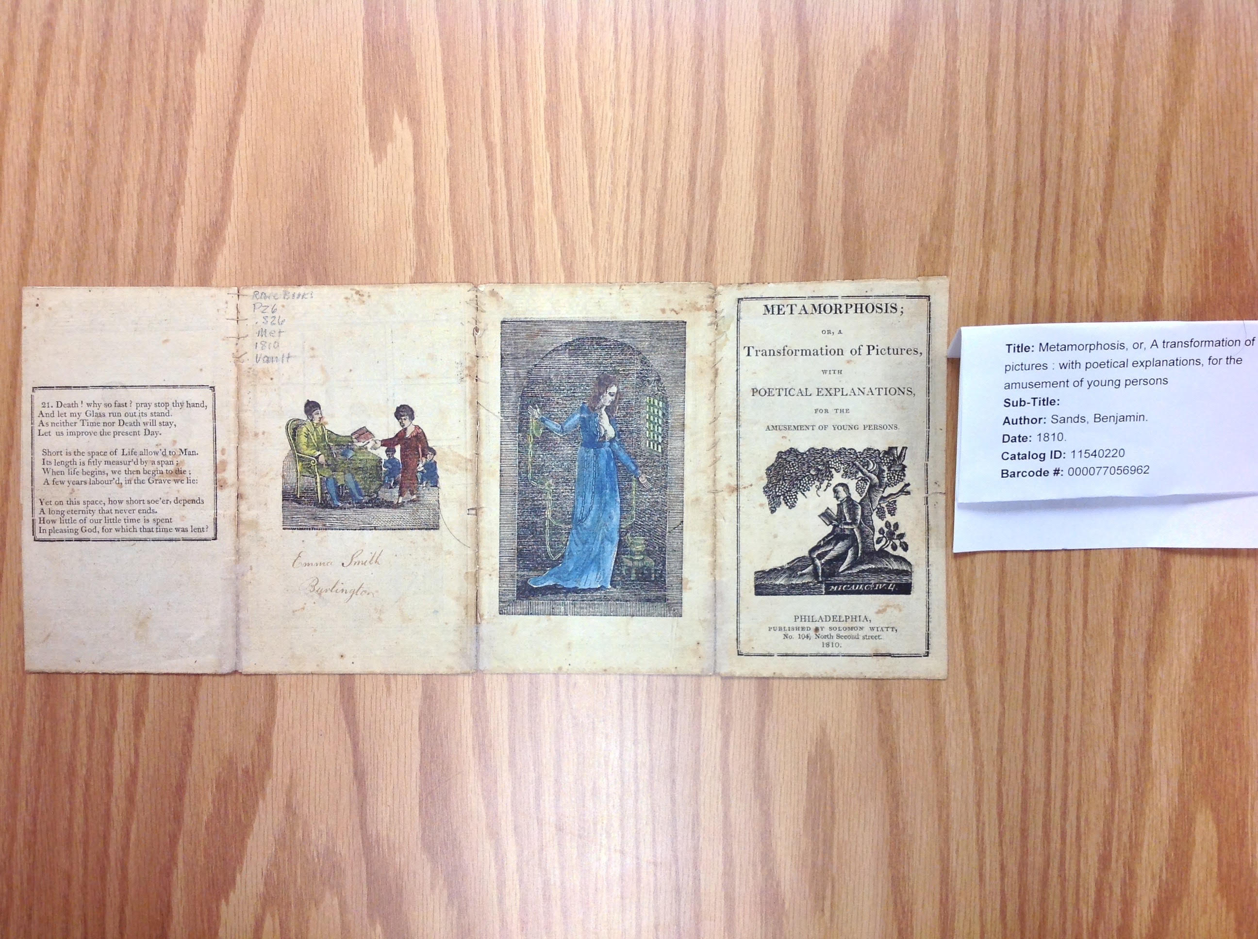
The 1810 version was published by Solomon Wiatt at No. 104, North Second Street, Philadelphia, PA.  The 1811 version was printed and sold by Joseph Rakestraw at No. 248, North Third Street, Philadelphia, PA.  These two addresses appear to be only one street apart from one another.  The similarities between the two versions are striking; however; they are not without differences.

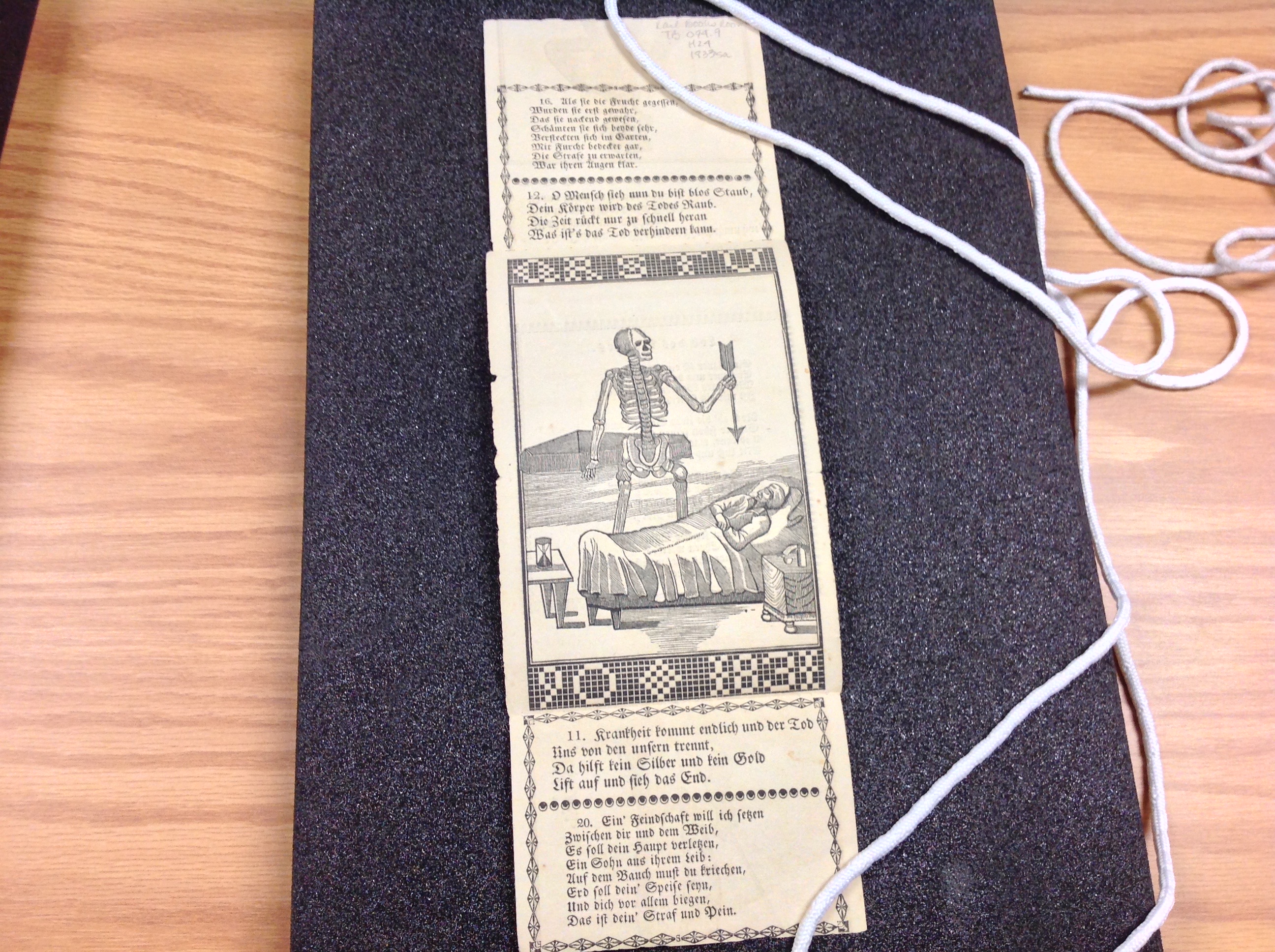
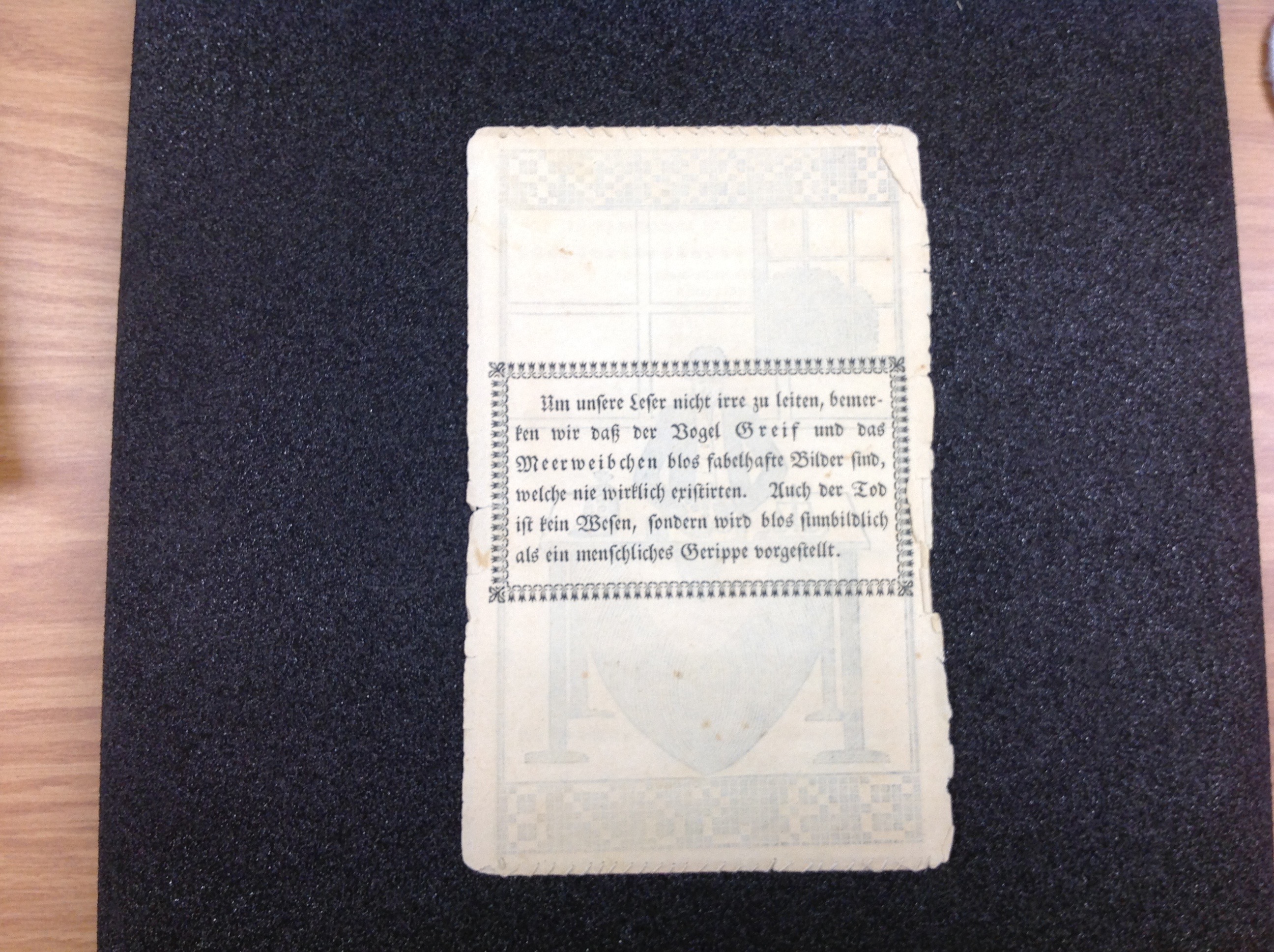
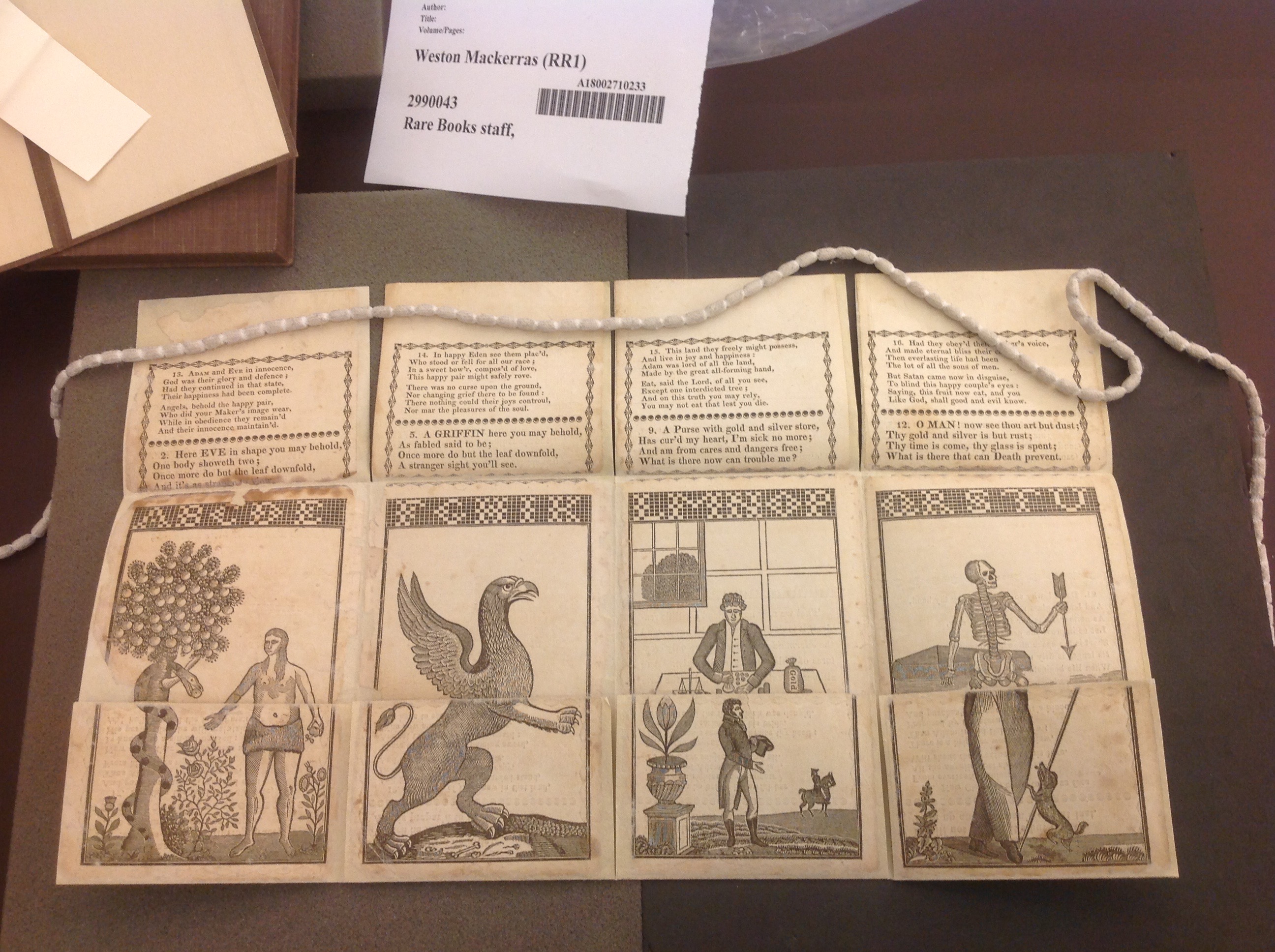
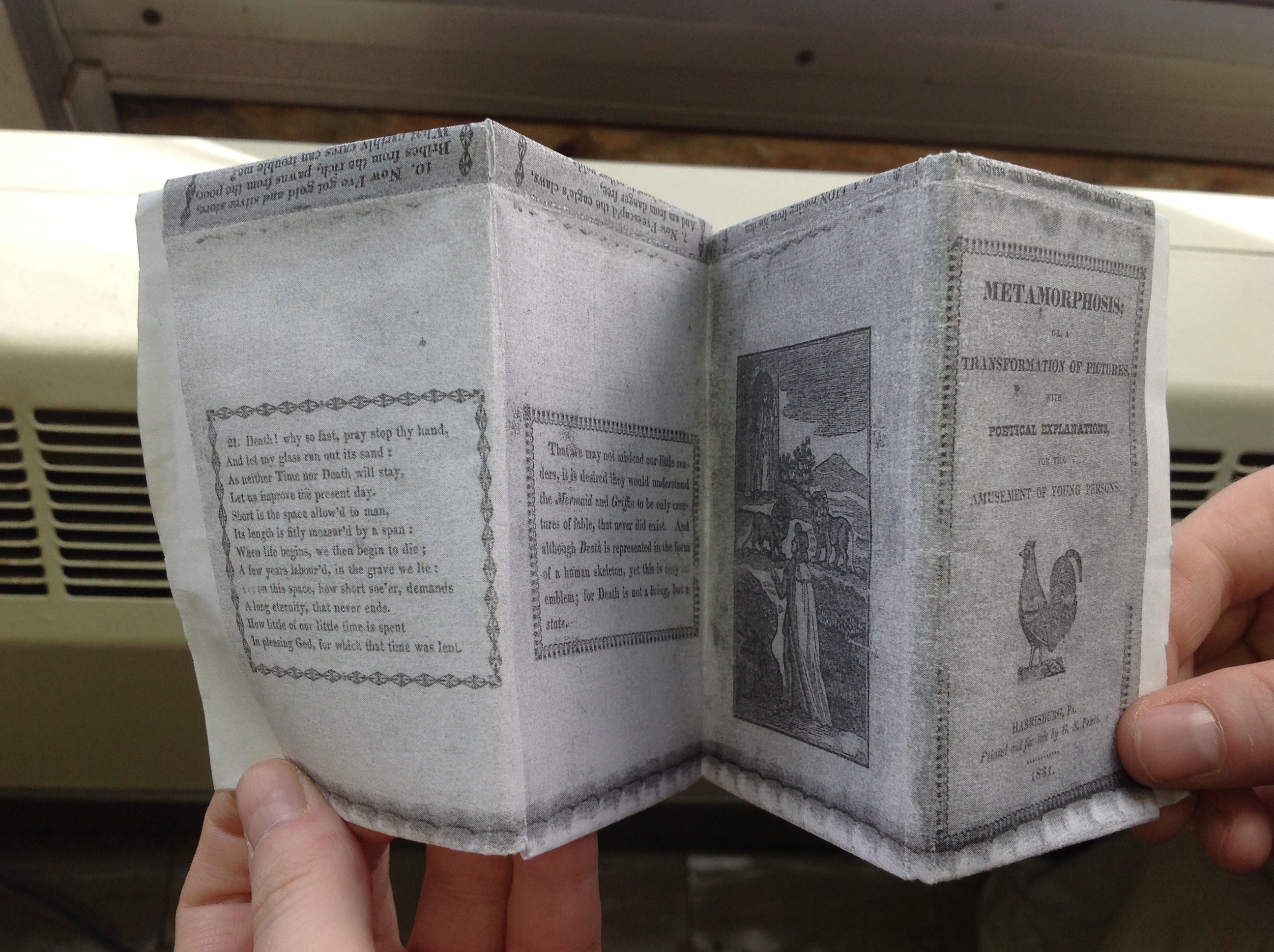
The images in the main text of both versions are identical, though the images on the verso differ.  In Wiatt’s 1810 version, there is an image of a man seated in a chair and handing a little boy a book, and an image of a woman in chains in prison.  In Rakestraw’s 1811 version, there is an image of a woman beneath a tree with a reclining African American man beside her, and an image of a couple fleeing.  The title pages also both feature the same image of a man sitting underneath a tree.  According to Welch, Wiatt’s 1810 version is the first one to feature this image (392).

Verso of Wiatt’s 1810 version (top) and verso of Rakestraw’s 1811 version (bottom) (Special Collections, Penn State Libraries)

Interestingly, Rakestraw’s 1811 version and Pounder’s 1811 version are completely identical in the images they use, including the extra images on the verso.

Verso of Jonathan Pounder’s 1811 version. (Bodleian Library, Oxford University Vet. K6 f.92)

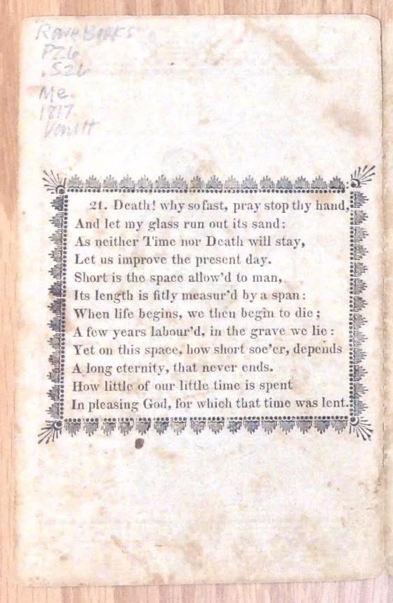
The text in Wiatt’s 1810 and Rakestraw’s 1811 is also identical, with only a couple of minor differences, likely due to typographical errors (i.e. the occasional missing comma, and the misspelling of “Saviour” as “Savour” in Rakestraw’s 1811 version).

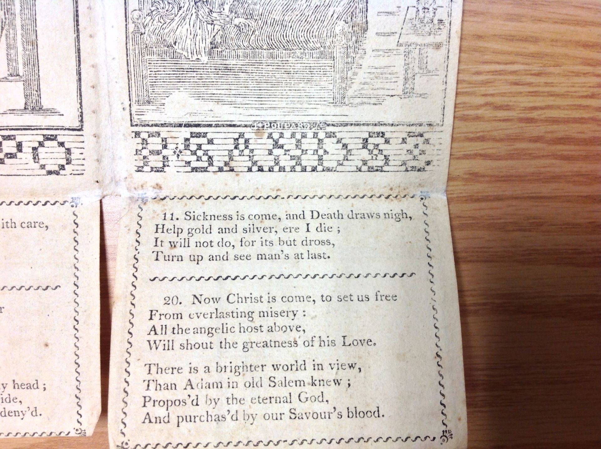
Misspelling of “Saviour” as “Savour” in Rakestraw’s 1811 version. (Special Collections, Penn State Libraries)

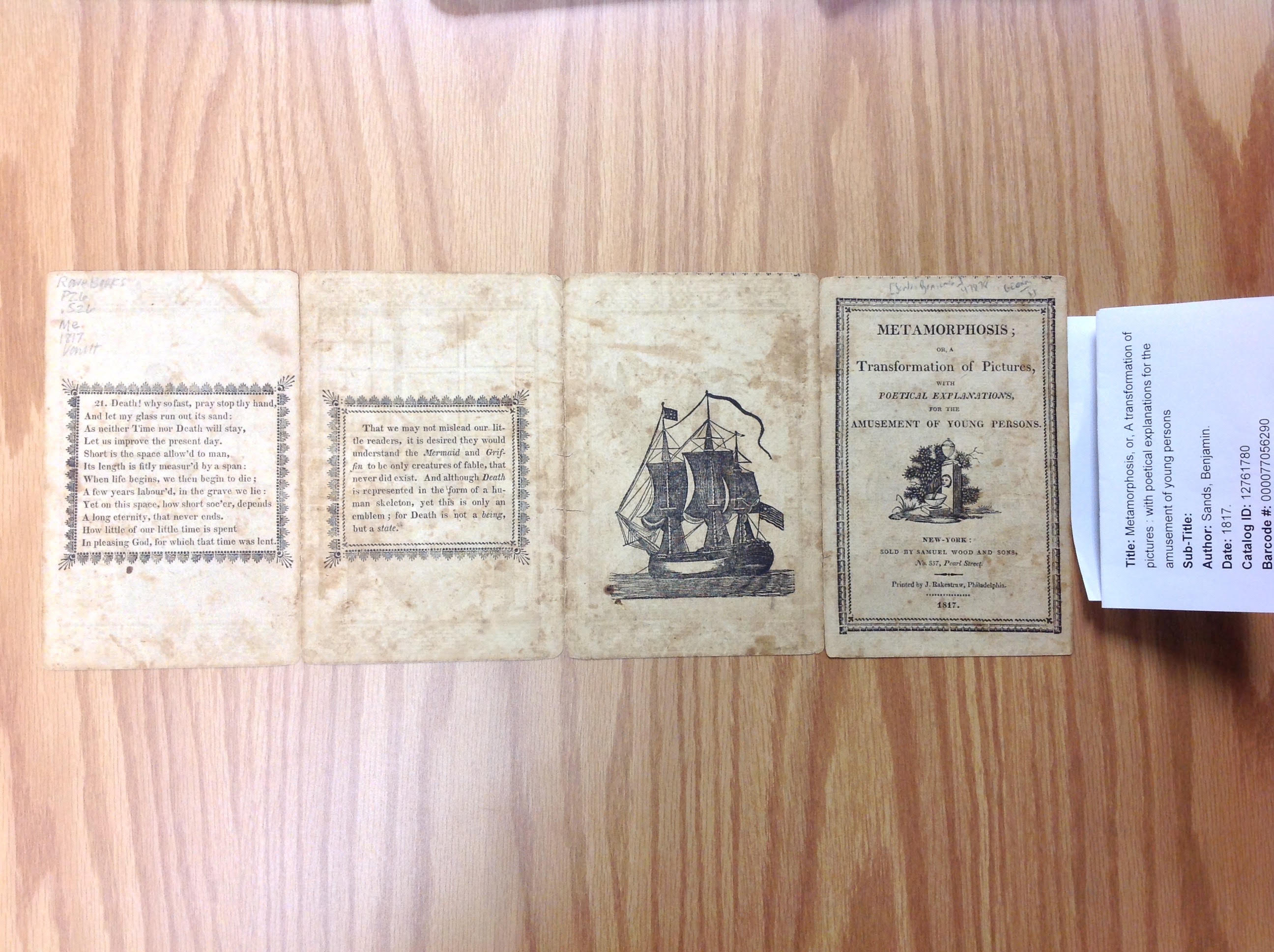
The biggest differences, however, were not in the images or the text.  The most striking difference is the size of the paper.  The 1811 version printed by Rakestraw is visibly larger.  It measures approximately 14 ¼ inches x 5 ¾ inches, while the 1810 version published by Wiatt is approximately 13 ½ inches x 5 5/8 inches.  This means that the difference in length between the two is about ¾ of an inch, and the difference in width is about 1/8 of an inch.  While the widths of the two texts are very close in size, the lengths are significantly different.

Wiatt’s 1810 version (top) and Rakestraw’s 1811 version (bottom). (Special Collections, Penn State Libraries)

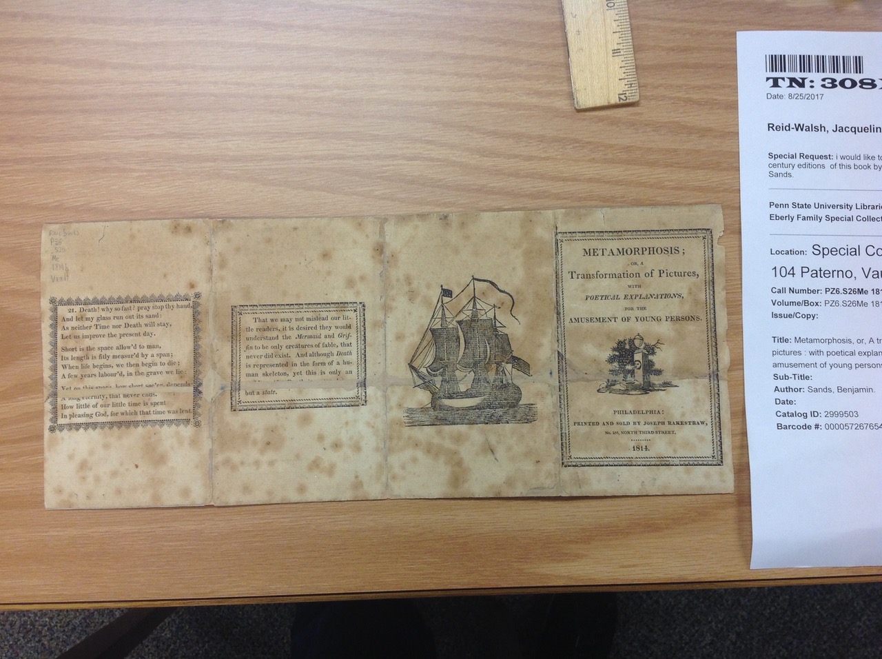
Another interesting difference between the two are the borders used in each version.  In the 1810 version by Wiatt, when the flaps are closed, the borders around the text are straight and rectangular, except for the set of verses numbered 7 on the top flap of the third panel.  Here, the border is a wavy line rather than a straight line.

Wiatt’s 1810 version (top) and Rakestraw’s 1811 version (bottom). (Special Collections, Penn State Libraries)

When the flaps are open in the 1810 version by Wiatt, they all have wavy borders around the text, matching the 1811 version by Rakestraw.  The only difference between these two versions when all of the flaps are open is the dividing lines between the original verses and the added verses.  In Rakestraw’s 1811 version, all of the dividing lines are wavy, matching the borders that surround the text.  In Wiatt’s 1810 version, however, the dividing line has a different design, with the exception of the top flap on panel one featuring sets of verses numbered 13 and 2, which strangely matches the wavy dividing line of Rakestraw’s 1811 version.

Wiatt’s 1810 version.  The wavy dividing line featured on the left matches the wavy dividing lines used in Rakestraw’s 1811 version. Special Collections, Penn State Libraries)

We have enjoyed comparing these two texts and going forward we are excited to look at other versions of Metamorphosis books that are presently being catalogued at Penn State. With the help of curator Jose Guerrero, Jacqui was able to locate a few more versions.  In addition to the 1811 version, there are 1815 and 1816 versions, both also printed by Joseph Rakestraw.  This means that Penn State now holds editions printed by Rakestraw from 1811, 1814, 1815 (a hand-colored version), 1816, and 1817, which we are excited to compare when we return in the fall.

Who are G.S. and G.C. Peters?

By Colette Slagle and Jacqueline Reid-Walsh

In our continued explorations of the English and German versions of the Metamorphosis books printed by G.S. Peters in Harrisburg, we began by searching for Peters through our Union Catalog website (http://openpublishing.psu.edu/play/).  We searched both “G.S. Peters” and simply “Peters,” and to our surprise found an additional entry for the latter listed under the name G.C. Peters.  There is an 1831 German version held by the William L. Clements Library at the University of Michigan, an 1831 English version held by the Bodleian Library in Oxford (this entry currently being added to the Union Catalog), an 1833 German version held here at Penn State, and an 1843 English version held at Library Company of Philadelphia.  While three of these are listed as having been published by G.S. Peters, the version held by the University of Michigan lists the publisher as G.C. Peters.  This discovery lead us to question who these two Peters were, and what the connection was between them.


We then went on a search to learn more about G.S. Peters—and were pleased to discover what we found!  G.S. Peters (Gustav Sigismund Peters) was born in Langebrück, Germany near Dresden in 1793 (Earnest et al. 6).  He immigrated to America in 1820.   He lived in Baltimore and Carlisle before eventually moving to Harrisburg in 1827.  While in Carlisle Pennsylvania, Peters began a partnership with Johann B. Moser and the two opened a stereotyping foundry and printing office (Cazden 323).  Peters printed primarily in German, though he printed in English as well.  He was a commercial success as a printer and is credited with being the first in the country of being a commercial success for printing in color (Earnest et al. 6).  Even a basic Google search showed the shear extent of his printing—from chapbooks to turn-up books to baptismal certificates and beyond.


When we searched G.C. Peters we found some results, though fewer than G.S. Peters.  We were immediately struck by the similarities in style, dates, and locations between the two men.  We wondered if the two might be related, or if they were actually the same person.  We then contacted the William L. Clements Library at the University of Michigan, and their Head of Reader Services, Terese M. Austin, kindly sent us a pdf of their 1831 text for our research purposes.  As their version is in German, we compared it to the 1833 German version Penn State holds.  Both are printed in the typical Fraktur font, a blackletter typeface that was common for Pennsylvania German texts at this time (Earnest et al. 5-6; “Fraktur”).


We noticed that the two are very similar overall, and that the publisher names listed are identical.  Both are actually published by G.S. Peters, though because of the Fraktur typeface the “S” is a bit hard to decipher, particularly for an English-trained eye. When comparing the appearance of the capital “C” and “S” in Fraktur style, it is clear how easy it would be to mistake the two.  Jacqui noticed that the S looks much more like a serpent in the way it twists in on itself.

Cover of 1833 German version (Photo courtesy of Penn State Libraries, Special Collections)

Now that we have ascertained for ourselves that G.C. Peters and G.S. Peters are most likely the same person, we would like to compare the two English and two German versions of the Metamorphosis books that we are currently aware of.  We are curious about the similarities and differences between all of Peters’s versions of the text, and if there may be even more versions that we have yet to stumble upon.

Works Cited
Cazden, Robert E. A Social History of the German Book Trade in America to the Civil War. Camden House, 1984.
Earnest, Russell D., et al. Flying Leaves and One-Sheets: Pennsylvania German Broadsides, Fraktur, and Their Printers. Oak Knoll Press, 2005.
“Fraktur (Pennsylvania German Folk Art).” Academic Dictionaries and Encyclopedias, enacademic.com/dic.nsf/enwiki/756721.

How to work in German when you can’t read German?

By Jacqui Reid-Walsh and Colette Slagle

During our latest excursion to Penn State Special Collections we spent some time comparing the two Metamorphosis turn-up books, both published by G.S. Peters in Harrisburg.  The 1831 version (located at the Bodleian Library) is published in English and the 1833 version (located at Penn State Libraries) is published in German. The two are very similar visually, particularly in terms of the images used.  We presumed the 1833 version is a translation of the first partly because the date 1831 is left in the lower right of the sampler border under the skeleton.

1833 German version with 1831 date in sampler border (Photo Courtesy of Special Collections, Penn State Libraries)

Although the format and images of the two versions are quite similar, the script is strikingly different—the 1833 German version is in blackletter. The note to the reader is present in both (and basically the same in content), but differs slightly in appearance.  For example, there are no italics in the German version of the note to the reader due to its blackletter script.

Note to the reader 1831 English version (Photo Courtesy of Bodleian Library, Oxford Dep. f.135)

Note to the reader in 1833 German version (Photo Courtesy of Special Collections, Penn State Libraries)

We also noticed that the last set of verses in the English version (no 21) is absent in the German version. Instead, the poem ends with the set of verses numbered 20, and an additional poem is included in place of number 21. Since neither of us is versed in German, we referenced the loose German translation of the text located on the Learning as Play website.  The poem included in place of the last set of verses is titled “Praise of the Peasant,” and tells an entirely different story about honoring peasants for their labor—quite different from the Fall of Man!

“Praise of the Peasant” poem in 1833 German version (Photo Courtesy of Special Collections, Penn State Libraries)

We then went through the German translation and compared it to the English version. The core verses (numbered 1-12) appear basically the same, but in the second extended poem (numbered 13-21 or 20, depending on the version) there are some notable differences.  While the trajectory of the story is similar, the plot speeds up a bit in the 1833 German version due to the omission of the last set of verses (no 21).  This begins with set of verses numbered 14, and as we read through both versions of the text side by side from that point on, we noticed that the German version seemed to be about one set of verses ahead of the English version.  For example, while the set of verses numbered 14 describes Adam and Eve in the Garden of Eden, the set of verses numbered 14 in the German version details God’s warning to Adam not to eat the fruit which is not described in the 1831 English version until number 15.

14. In happy Eden see them plac’d,

Who stood or fell for all our race ;

In a sweet bow’r, compos’d of love,

This happy pair might safely rove.


There was no curse upon the ground,

Nor changing grief there to be found :

There nothing could their joys control,

Nor mar the pleasures of the soul.

1831 English version (Bodleian Library, Oxford Dep. f.135)


14. Adam, you shall not eat
Of this fruit, listen,
If you forget this now,
You will be a dead man ;
Death will rightfully struck him
Who disdains my word,
As well as his race,
Adam, consider this well.

1833 loose translation of German version (Special Collections, Penn State Libraries)


15. This land they freely might possess,

And live in joy and happiness :

Adam was lord of all the land,

Made by the great all-forming hand,


Eat, said the Lord, of all you see,

Except one interdicted tree ;

And on this truth you may rely,

You may not eat that lest you die.

1831 English version (Bodleian Library, Oxford Dep. f.135)

Set of verses numbered 14 and 15, 1831 English version (Photo Courtesy of Bodleian Library, Oxford Dep. f.135)

Set of verses numbered 14, 1833 German version (Photo Courtesy of Special Collections, Penn State Libraries)

Other than learning German, we are interested in learning more about the relationship between the English and German versions going forward.  In particular, we are planning to explore in more detail other versions of Metamorphosis in English and German published by G. S. Peters in Harrisburg.

Turn up, Turn down, turn over: the verso of Metamorphic books

By Colette Slagle and Jacqueline Reid-Walsh

Jacqui first became intrigued by the method of descriptive bibliography when sitting in on a rare books class at McGill. She notes that she was both struck and flummoxed when her mentor, Dr. Richard Virr, told everyone to turn the object over to see what we could learn. At the time, she could deduce nothing. Since then she has learned more about analyzing objects, and we spent some time turning objects over while sitting in Rare Books.

This skill has become crucial to understanding the Metamorphic books.  Analyzing the Metamorphic books as both an object and a text is imperative to make meaning from them due to their turn-up book format.  Upon examining the versos of the various Metamorphic books (1810, 1811, 1814, 1817, 1831), we made a few observations—and had even more questions.

One observation was that the title page is part of the verso.  The first panel without flaps serves as a title page and includes the title and publishing information.  When the strip is folded into a pamphlet format, this appears on top.  However, when opened it is clear that the title page is actually the back of the first flapped panel of Adam and Eve.  Furthermore, when the strip is turned over and laid flat, the title page clearly becomes part of the verso.

Back of the 1811 version. The image of the man sitting under the tree acts as the title page, but when laid flat it is part of the verso. (Bodleian Library, Oxford University Vet. K6 f.92)

Similarly, the final set of verses (numbered 21 except the 1811 edition) always appear on the back of the final flapped panel which features a man turning into a skeleton. The middle panels without flaps on the back vary the most.  The images change frequently, and bear no resemblance to the content of the verses or to the flaps.  They are random and decorative, some are colored, some not, but they all provide different contexts to the rest of the text.  For example, some woodcuts are reused.  In the 1810 version, the image on the back of the second flapped panel (featuring the lion and eagle) is of a provocative woman in chains, her dress colored in a deep blue.  According to D’Alte Welch, the image “was used for a frontispiece to portray Maria Martin in The History Of The Captivity and Sufferings of Maria Martin.  Philadelphia: Printed and sold by Joseph Rakestraw, 1809” (392).

1810 version featuring image of a woman in chains (Special Collections, Penn State Libraries)

Once the note to the reader is introduced in the 1814 edition, its location remains the same in other editions—i.e., on the back of the heart and money bag flapped panel.  The question that arises is when the note is meant to be encountered by the reader.  Because of the many possible ways to fold the pamphlet, and the immense difficulty of knowing for sure how the text was meant to be folded, the note to the reader can appear in different positions within the text.  For instance, when folded accordion-style, the note is hidden inside the booklet.

Amateur facsimile of 1831 version folded accordion style (Bodleian Library, Oxford Dep. f.135)

When folded inward upon itself, the note appears next to the first flapped panel with Adam and Eve.  In this case, the image on the back of the flapped panel with the lion and eagle becomes the end page.

Amateur facsimile of 1831 version with panels folded inward (Bodleian Library, Oxford University Dep. f.135)

However, when laid out as a strip, it subverts the typical notion of front and back in a conventional book or codex format.  We’ve come to realize that recto and verso are a more useful way to think about how the Metamorphic books are structured as they attend to the physical object rather than the content of the text. According to Wikipedia, “The terms are shortened from Latin rectō foliō and versō foliō, translating to ‘on the upright side of the page’ and ‘on the turned side of the page,’ respectively.”

Verso of 1817 version (Special Collections, Penn State Libraries)


Works Cited:

“Recto and Verso.” Wikipedia, Wikimedia Foundation, en.wikipedia.org/wiki/Recto_and_verso.

Welch, D’Alte A. A Bibliography of American Children’s Books Printed Prior to 1821. American Antiquarian Society, 1972.

Questions that arise when comparing transcriptions of two versions of Metamorphosis; or a transformation of pictures, with poetical explanations, for the amusement of young persons. Philadelphia Joseph Rakestraw no 256 North Third Street: 1814 and 1817

By Jacqui Reid-Walsh and Colette Slagle


This metamorphosis book is important in the development of the strip format to a booklet format since the 1814 edition is the earliest known publication that includes a note to the child reader. The notes shows a concern for the potentially terrifying movable images and dire words on the readers’ psyches.

1814 version with mending tape. (Photo courtesy of Penn State Libraries, Special Collections) For larger view see image gallery page of website.


Unfortunately, one line of the note is largely obscured with what appears to be mending tape, an intervention that was presumably performed by an earlier collector. Fortunately, special collections also owns an 1817 edition also published by Rakestraw. It has the same cover and the same order and numbering of verses. Since it is in better condition we can easily read the full text of the note:


“That we may not mislead our lit-

tle readers, it is desired they would

understand the Mermaid and Grif-

fin to be only creatures of fable, that

never did exist.  And although Death

is represented in the form of a hu-

man skeleton, yet this is only an

emblem ; for Death is not a being,

but a state.”


1817 clean version of note to reader. (Photo courtesy of Penn State Libraries, Special Collections)

In addition, we noticed discrepancies between the two versions that take us back to all four versions transcribed so far (1810, 1811 {in the Bodleian), 1814 and 1817). The most obvious change in the 1817 version is the spacing in the final set of verses (no. 21) that unusually are presented as one stanza.  In the three earlier versions no. 21 is split into three stanzas. Furthermore, the final punctuation mark has changed slightly among the versions. In 1810 the verses end with a question mark, in 1811 the final punctuation is an exclamation point. In 1814 and 1817 a period is used.  The different punctuation marks change how the sentence is read and casts a different inflection on the final message. The lines read: “How little of our little time is spent/ In pleasing God, for which that time was lent” Reading aloud together we could hear how the moral changes considerably with different punctuation. We move from a question that demands an answer, to emotional affect, to neutral observation.

1810 version last set of verses ending with question mark. (Photo courtesy of Penn State Libraries, Special Collections)

1811 version last set of verses ending with an exclamation point. (Photo courtesy of Bodleian Libraries, Vet. K6 f.92)

1817 version with one stanza instead of three, and the verses ending with a period. (Photo courtesy of Penn State Libraries, Special Collections)