Schematic Design Project Statement

Our site is located in historical and industrial Brooklyn on the edge of Bushwick Inlet that leads your ideas to a picturesque view of Manhattan. The land has been compromised though, being labeled as a brownfield and has not been turned into a park, as the people were promised over ten years ago. My design encompasses both of these by creating a park that borders on a constructed wetland that surrounds the inlet. The constructed wetlands and bio swails work to bring the land and area back to life. With a focus on community, the complex draws people in with multiple public sections within the complex. Varying heights and materials guide people to public spaces and away from private ones.  A focal public space is the hose drying tower that allows pedestrians and the community to ascend the tower to view the daily workings of the firefighters as well as the amazing views surround the sight. The building itself is made from planes derived from the angular streets that lead to the inlet. Through theses planes, the land is pulled back to create wetlands and a communal area with a publicly and privately segmented building.

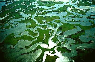
Beaufort Inlet Wetlands, NC

Photographer Credit: not available

Schematic Design Statement

The design of my building is based off of Louis Kahn’s concept of servant versus served spaces. The building is designed to maximize functionality as a fire station without sacrificing the comfort of the occupants. The plan is based on a structural grid developed based on square footage for storage areas interspersed between fire engine bays. The building is also meant to be a transition point between the city and the public park on either side of the building. One side of the building conforms to the surrounding city streets while the space on the opposite of the building integrates into the park. Overall the building is meant to be a place of community for the fire fighters and surrounding community members.

SD Project Statement

Image: BP Pedestrian Bridge Photographer: Chris Smith
Image: BP Pedestrian Bridge
Photographer: Chris Smith

    In its unique context along a developing waterfront, the Brooklyn fire station serves to bridge the urban and natural environments with flowing exterior paths while balancing the public and private uses within the complex. Two pathways lead from the busy street, through the fire station complex, to a museum and dock at the water’s edge. The pathways form the enticing voids between the solid public, semi public, and private buildings, drawing in the passerbyers within the complex. Another pathway flows through the site along the west side of the fire station, offering bikers and city goers views into the fire station on one side and to the skyline of Manhattan on the other. The three separate buildings offer an effective division of public and private spaces for security, enhanced user interaction, and sustainable design. Materiality is more solid facing the urban context, with dissolution of the materials toward the south sun and sloping site of the water. Through its converging circulation, the fire station engages public interest within the complex and throughout the waterfront while maintaining a sustainable impact on the site.

Paul Karasik – 9/30/2015

At the start of his presentation, Paul Karasik uttered the line, “reading more stuff does not mean knowing more stuff.” He spoke about how you can read thousands of books and magazines and do countless hours of research on a particular subject, but absorb little to no knowledge about it. In fact, the only way you can gain a broad range of knowledge in life is to “study something you love in depth!” This phrase, according to Paul Karasik, was the most important aspect of his presentation. That’s what inspired his career and his successes in the cartoon industry. He found passion in his art and was inspired to turn that passion into a career. While a graphic designer in his own right, he likened that ideology to architecture and design in general. How can you hope to inspire your clients or users if there exists no sort of passion emanating from the source of that design?

That being said, what I found to be most fascinating about attending this lecture was how Paul carefully described the components of creating a successful comic. A viewer’s eye will look at the top left corner of an image and work its way to the right side. A trained artist will design his or her comic so as to assist the eye’s process in focusing on the “focal point” of the piece. For example, the less important aspects of the piece will be angled or pointed in the direction to which the artist intends your eye to travel. Eyes and noses of supporting characters are popular subjects through which to aid this optical guidance, though Paul heavily discussed one of his own comics in which he utilized the branches of a tree to direct his audience’s glances.

In regards to architecture, Paul talked about how he firmly believes that function comes before form. Though he did not cite any specific architectural examples, he utilized the sizing of rectangular frames in the comic strip Nancy, to support his belief. The artist of this comic created frames that were appropriately sized for the content that they were holding. (For example, a panel featuring three characters was longer than the panel only featuring two.) That being said, Paul emphasized that the panel with the punch line of the comic should always be the most prominent. That is the point that to which you are trying to direct your audience’s attention; they need to understand that. This aspect would also apply to the design of a building, for example. All in all, it was a fascinating lecture that spanned such topics as graphic and comic design, story development, the history of comics, and the overall work of Paul Karasik. I was very fortunate to be able to attend.