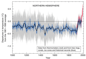
It really is interesting to see all that is happening at Penn State without us even really hearing about it! The “Hockey Stick” graph is probably the first thing that is brought up in any legitimate climate debate whether it be for or against climate change and how we are managing our time on this planet. This graph (Shown here)
 Is one of the most iconic graphs of all time in the climate war debate It has been used by many and has caused a great deal of controversy for professor Michael Mann who even wrote a whole book on this “Hockey Stick”. It has been said that this graph is wrong and it has been manipulated multiple times but nothing says that he is wrong and there’s research from multiple prestigious universities to back up this claim!
Climate change is real, but it’s not something new to the earth.
References:
http://news.psu.edu/story/344876/2015/02/14/research/iconic-graph-center-climate-debate

Good, but the post needs some math (as well as some references!). Could you try to explain some of the mathematical ideas that went into “reconstructing” the climate record in this way? Mann’s book gives a non-technical description, or Google “principal component analysis” for the more technical stuff.