Architectural Periodical: Arcade
Thesis: Designing an environment that engages and stimulates employees through the five senses leads to a more productive work environment.
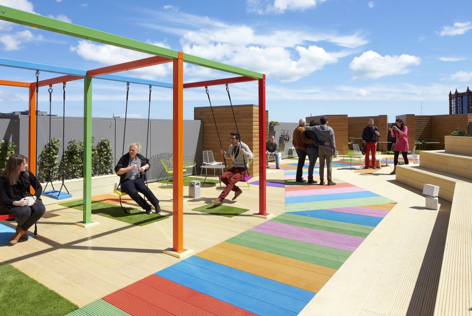
Since the invention of the cubicle, mundane office life has plagued the workplace. Employers have made efforts in trying to make the office a more comfortable and productive working environment but most see it as an extra expense. Big corporations like Google have built office spaces essentially comprised of adult playgrounds so that their employees feel appreciated and enjoy their working environment.
While this seems great, what about the small businesses that cannot afford to build outlandish spaces? Designing an environment that engages and stimulates employees through the five senses leads to a more productive work environment. Studies have shown that designs that respond to a greater number of senses are more successful than those that only engage one or two. Jinsop Lee, an industrial designer, gave a TED talk in 2013 about design that engages the five senses. He explained using his own sensory chart that designs that included all five senses resulted in better experiences than those that just responded to one or two. The example Lee used was a project he had in college. The professor asked the class to design a clock that used the sun. While Lee thought he was clever in using a sunflower, his classmate was more successful because he used cups of scented oils to tell the time. By appealing to more than one sense, his classmate made a more desirable and ultimately more successful product. It is important for the senses to be considered in design, especially in an office, and many of the strategies for doing so can be done on a budget. The ability to appeal to the senses in architecture, specifically in small business offices, creates more engaging spaces that people want to inhabit.
For a small business just starting out, office design may be the last thing on the list to fit into the budget. As long as there is a place to work the work will get done and for a short term this may be suitable, but for a business looking to be successful and productive long term it is necessary to create an environment that employees feel comfortable in. On the other hand, spaces can become too engaging and result in distractions. Placing a ping-pong table in the middle of a work space for example, may promote a fun and active atmosphere, but it can also be a temptation to play rather than work. There needs to a balance so that workers enjoy the space they spend a large portion of their day in, but can also do the job they are employed to do.
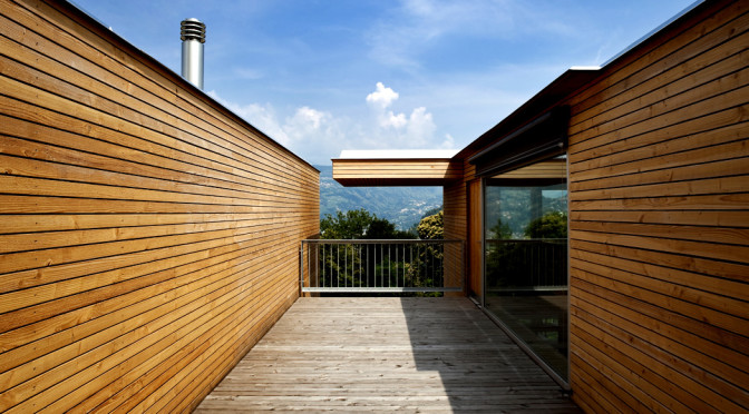
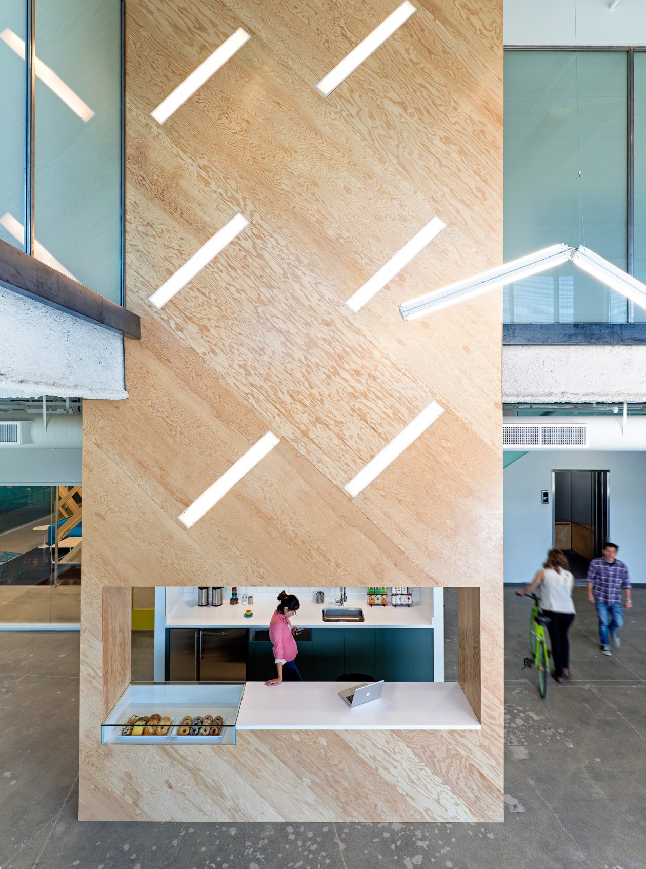
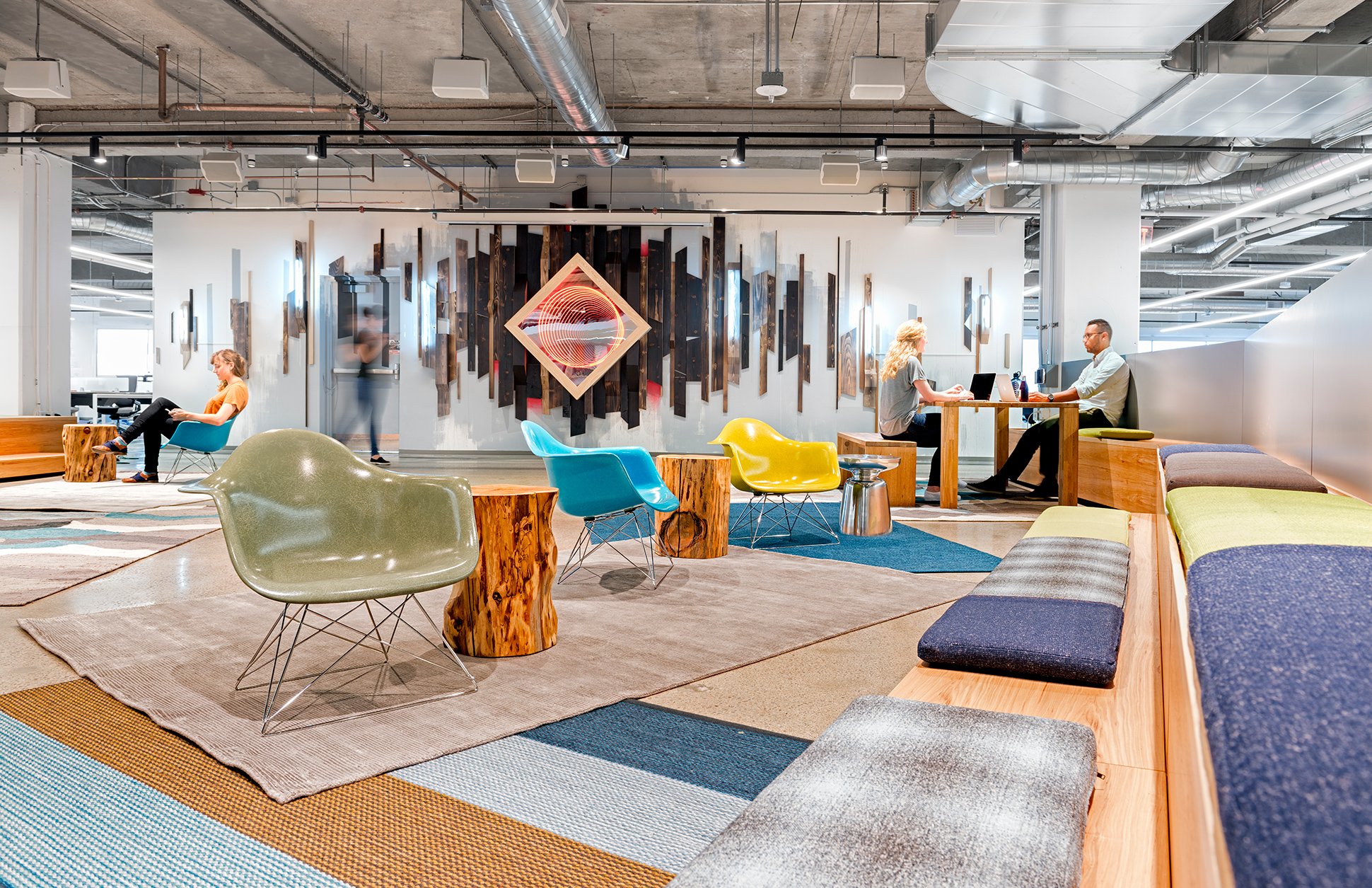
Designing a space to be visually pleasing is one of the most common ways to create an interesting space. People like to be visually engaged with their environment and one of the simplest and cost effective ways of doing this is by incorporating color. Offices are now painting their walls with bright colors both to “reflect employee tastes and personalities, plus company mission and culture” (Mokop). According to Heather Holz, bright colors have been proven to improve focus and energy. It has also been noted that different colors evoke different emotions and therefore their evocative nature should coordinate with the space in which it is used. For example, blue reflects a quality of calmness so it should be used in spaces like reading rooms or personal offices. Colors such as orange and yellow are more stimulating so they should be used in spaces such as conference rooms that generate a lot of discussion and collaboration (Holz). Another very important aspect to a healthy and productive office environment is natural light. Sabret Flocos, former founding principle of FOX architects, said, “being able to see the outside world has restorative influences” (Holz). Stephen Kellert, a professor at Yale University who focuses on the interaction of humans and nature, also argues that people enjoy spaces that utilize the natural environment and by using translucent materials such as glass to provide an abundance of natural light, the work environment will be enhanced. A well-lit working environment is not the only benefit from the use of natural light; it also can contribute to solar gain, which in turn lowers heating costs and creates a sustainable environment. By making these simple changes, small businesses can save money and provide an enjoyable work environment.
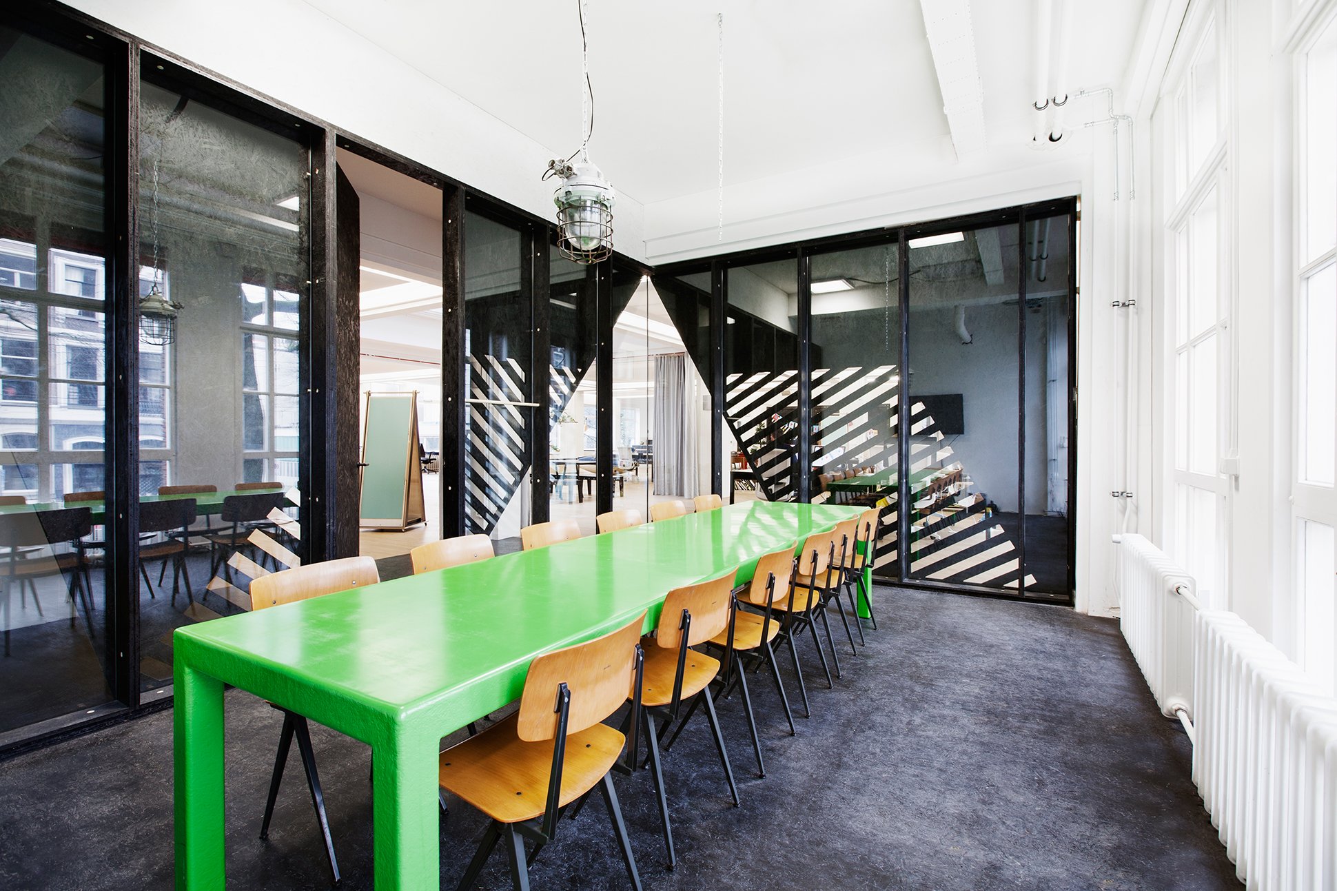
One downfall is that most startup companies are not able to build brand new buildings; therefore, renovating their existing space is the only option. Because the advertising agency Superheroes in Amsterdam, Netherlands, had a short-term lease they did not have a large sum of money in the budget dedicated to office space. Due to the expense of glass and other construction costs, the firm Simon Bush-King Architecture & Urban took this challenge and used OSB with CNC cutouts to break up direct views and let light into the office space of Superheroes. The material not only provides economical benefits but also provides an interesting backdrop for the office.
After sight, sound is one of the most important factors to consider in an office. The open plan concept is popular because it allows flexibility and promotes collaboration; however, workers tend to get distracted or annoyed by phone calls and surrounding conversations when they are trying to work. One way of avoiding this would be to organize the space into zones. By placing activities requiring collaboration together in one space and work that requires more individual concentration in a more private setting, employees are able to focus on the tasks at hand. Because space can be tight in small offices, dividing the workplace into zones may not be feasible. Using materials that absorb sound such as plants, cork, or felt can also separate spaces in an open plan. For example the use of plants to divide spaces will help damper the conversation in an area instead of reverberating throughout the office while also promoting a healthy environment through natural air filtration. Because plants require constant maintenance and do not absorb a majority of the sound, another option is to use felt.

Felt absorbs sound thus creating a quieter environment. Studio O+A used a felt installation on the ceiling in the startup company Livefyre’s engineering workspace. The engineering department wanted the best of both worlds, collaborative and individual spaces in one. To create the individual spaces, they designed soundproof booths in the walls that are both silent and comfortable. Limiting spaces divided by hard walls will help to lower sound reverberation, thus creating a less noisy and more productive environment.
Episodic memory is the memory of autobiographical events that can be associated with places or emotions. When people taste or smell things it usually prompts an episodic memory. Out of the five senses taste is the most difficult to design for. If taste is not taken literally, but rather the sensation of taste, people will associate this sensation with specific instances, or episodic memories. Certain textures and colors can remind workers of food or the feeling of food. Although this is a visual sensation it creates an oral stimulation through memory. The rich color and flowing pattern of marble can bring out thoughts of cream in coffee, producing a warm and comforting sensation. As Junhani Pallasmaa, a Finish architect and expert on designing for the senses, explains, “vision becomes transferred to taste as well; certain colours and delicate details evoke oral sensations.”
Toronto, Canada
Architects: Mariyama and Teshima
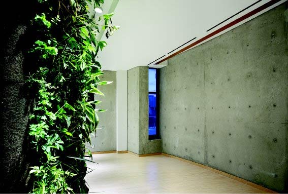
Another sense that tends to employ difficulties is smell mainly because people are sensitive to changes in scents. However, the sense of smell is extremely powerful in triggering memory. “The most persistent memory of any space is often its smell” (Pallasmaa). One way to stimulate the sense of smell in the office is by lighting candles or by having certain potted plants that give off a pleasant aroma. The use of plants also doubles as a sound barrier therefore the senses of sound and smells are appealed to creating a more dynamic space. By placing different scents throughout the office it will provide awareness of the different spaces and serve as a marker to employees and visitors alike. For example, the Toronto University the Multi-Faith Center uses a green wall with plants that give off a pleasant aroma. Behind the wall runs an HVAC duct that blows the scent into the meditation room providing a calm and relaxing space. Although this is not an office space, this system could be employed in the working environment.

People are fascinated by the sense of touch hence the creation of the Please Touch Museum. Texture can really set the mood for a space. Carpet and wood create a homey feeling whereas, steel, glass, and hard stone have a sterile feeling. Livefyre’s office creates a homey feeling for its employees by using materials typically found in their employees’ homes such as wood and area carpets. Designing for touch is important because people are in constant contact with the world around them, so creating a space that is comfortable to the touch reflects people’s mood.
Creating an enjoyable and comfortable workspace for employees is the most important thing a company can do to increase worker satisfaction and ultimately result in a more productive work environment. As designers we have the ability to put this thought into action. Designing spaces that focus on all of the senses could lead to innovative office strategies that are not only engaging, but economical as well. Large companies such as Google have the capital to convert all of their workplaces into lavish, colorful, and playful spaces, but enjoyable working environments should be experienced by all businesses. Small companies such as startups do not have the extra money to use on office design; many are just getting started and need to invest in more immediate expenses. However, “…workplace design should be considered a driver of employee output…” (Boucher). Employee comfort should be part of the initial business expenses because the health and wellbeing of a company’s employees is the backbone of a company’s productivity.
Featured Image: Frankly SF
Interior Designers: Homepolish Inc.
Sources:
Moskop, Susan. More buisnesses wear their personalities on their walls. Chicago Tribune, 2015. Web. 22 Oct. 2015. http://www.chicagotribune.com/bluesky/originals/ct-workplace-colors-bsi-20150923-story.html
Fedele, Angela. Four Ways to Reduce Office Noise. Sourceable, 26 June 2015. Web. 22 Oct. 22015. https://sourceable.net/four-ways-to-reduce-office-noise/#
Pallasmaa, Juhani. The Eyes of the Skin: Architecture and the Senses. London: Academy Editions, 1996.
Holz, Heather. Sensory Architecture: Redefining How One Interprets Space. Fargo: North Dakota State U, 2011. “Engage the 5 Senses to Inspire Workplace Productivity.” Convene.N.p., n.d. Web. 27 Sept. 2015.
Kellert, Stephen R. Building for Life: Designing and Understanding the Human-Nature Connection. Washington: Island, 2005. Print.
Boucher, Bernice. “Measuring the Economics of Engaged Workplaces.” Work Design
Magazine 8 Feb. 2014: n. pag. Web. 11 Dec. 2015.
<http://workdesign.com/2014/02/measuring-economics-engaged-workplaces/>.