One of the most common reasons that visitors come to the Libraries’ site is to check the hours. Specifically users usually want to know whether or not we’re open right now and for how long. This is especially true for our patrons accessing our site from their mobile devices. These are all assumptions that were built into the way our new site’s hours and locations are displayed.
The new page, Hours and Locations shows a week’s worth of hours information for all of the University Libraries’ locations. As a side note, the separation out of Commonwealth Campus Libraries has been removed, and usability tests have shown that students inside the Commonwealth Campuses do not immediately understand the distinction — so putting all of the libraries together sorted by University Park and its 40,000 plus students first actually makes it simpler for all users. So, when a patron visits this page from a mobile device, the view is different. Only today’s hours are shown. This was done because, for one, showing a week’s worth of data on a mobile device runs into space limitations. Secondly this was done because the use case scenarios for mobile users on this page is much more likely to be of the immediate nature.
As it turns out, the usage statistics for the site appear to reflect our assumptions. The Hours and Locations page is the second most viewed page on our site for our mobile users. Further fully 32% of all traffic to that page over the last month came from a mobile device. This is significant especially considering that when you look at all of the site’s traffic, only 7% of the traffic comes from mobile devices. So this page receives somewhere between 4 and 5 times the mobile traffic that the rest of the site receives on average (yes the data sample is small, so it’s something we’ll keep an eye on).
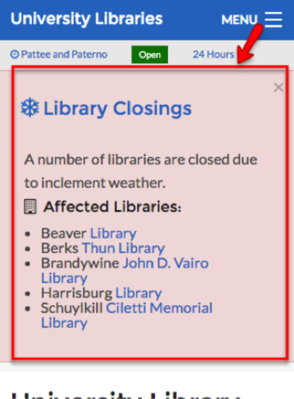
One other mobile-friendly item to highlight in this post lies within something we call the “global header” — meaning the top of the page on every page. In the new site, when you visit from a small-screened device, you’ll see a global header that is easier to use for a condensed touch interface, including a display of today’s hours at Pattee and Paterno along with an open/close indicator. This gives mobile visitors immediate information about what can be assumed would be the number one reason for using the site from a mobile device – and it is added without any cost to using the rest of the page. What I mean by that is that it is not distracting and does not hinder usability of the rest of the site’s content.
Here’s a screenshot that demonstrates both the hours indicator in the global header and the display of the Hours and Locations page.
 So, try it out for yourself sometime! And thanks for reading! If you have any questions or feedback, please let us know. — Charlie Morris, I-Tech programmer analyst


